Color directive is an integral component of the design
Driscoll Children’s Hospital is one of eight free-standing pediatric hospitals in the state of Texas, and the largest and most established in South Texas. It offers more than 30 medical and surgical specialties to residents of a high-poverty and under-served region. The new Driscoll Children's North Pavilion is remarkable for its use of color to support the institution's brand, create an intentional first impression on patients and their families and function as a means of wayfinding in this bilingual community. The approach was so successful a national healthcare magazine used it as a cover story.
The original building that houses Driscoll Children’s Hospital (DCH) dates to 1953 and is still in use today. Page has had the opportunity to work with DCH for the past 20 years on interior renovations and significant building expansion projects. Most recently, the new five-story, 180,000 square foot pavilion expands the campus by creating connectivity from the parking garage to all major DCH buildings and services. It houses the 22-bed Pediatric Intensive Care Unit and Outpatient Services Lab as well as a Day Hospital for outpatient surgery.
At the outset, Page and the client agreed that color was to be an essential element of the Pavilion’s design expression, not just paint applied to walls and other surfaces. The design team set out to establish a clear and resolute design concept that utilized color as a functional theme. The Pavilion celebrates color and how that color is expressed in light and form, both inside and out.
Meeting the users' needs through design
“To walk the Pavilion through the eyes of a child, from the colors to the fun elements, touching that childlike wonder around every corner, that’s probably what is most pleasing and exciting to me.”
– Donna Quinn, DCH Vice President Operations & Quality
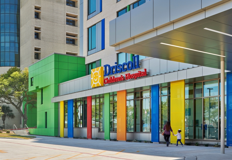
Exterior Use of Color
First, Page designed a new entrance to the DCH Emergency Department. That 6,000 square foot expansion was the first project in a comprehensive Campus Expansion & Modernization Program and was significant because it began a facility transformation to create truly signature branding that embraces the use of color in design and appeals to their younger population base. This double-height addition is located on the main building front façade, so it provided the perfect launching pad for a new visual identity for the institution.

The entrance features colored glazing in select façade bay windows that creates swaths of colored sunlight inside. Additionally, Page enclosed a new hospital elevator hoistway with rich, blue glazed brick to contrast with DCH’s base neutral-beige brick. Today, the new Pavilion takes that use of color to the next level, extending the rich and lively detailed color palette across the entire front façade of the institution to create a vibrant and exciting child-friendly environment.
Interior use of color
As a pediatric healthcare institution, DCH felt the prominent use of color in their branding and interior environments would create a positive first impression on children and their families by coalescing feelings of joy. It would be strategically used to enhance an environment of safety and establish a sense of belonging in what can be a very frightening environment for patients and parents alike.
Its use extends beyond the public spaces, continuing into clinical areas of the facility as well, where it is more subdued. The successful use of full spectrum color in these spaces to identify rooms and areas for patients and families also create a varied experience for staff and physicians.

Color as wayfinding
When the design team began discussions with DCH leadership about goals for the new Pavilion, a distinctive opportunity utilizing color was quickly identified. All entry points and major pathways throughout DCH would be connected into a singular linking experience and would be called Driscoll Way. It travels through existing public spaces and the new Pavilion is at its nexus. Color as a wayfinding tool has been a very successful element to help patients and families navigate throughout the facility.

