Publication
Better data visualizations to drive action
In today’s data-driven world, presenting sound logic and reasonably expected outcomes isn’t enough to persuade audiences.
In today’s data-driven world, presenting sound logic and reasonably expected outcomes isn’t enough to persuade audiences. Supporting statements and recommendations with objective, measurable quantifiers is essential, but communicating that data clearly and accessibly is key for gaining audience buy-in.
When data visualizations are cluttered with extraneous elements or unnecessarily complex details, they create confusion instead of clarity. This noise burdens the audience with increased cognitive load, which risks losing their attention entirely, as the effort to decode the message may not seem worth the time and effort.
The architecture and engineering industry relies on data for everything from proposals and qualifications to budgets and design recommendations. Well-designed data visualizations can help drive more effective decision-making, improve communication and collaboration, and minimize costly, intuition-based errors.
So, how can a firm harness the full potential of its data? By strategically presenting the insights with an audience-tailored approach, a concise message, and visualization(s) that leave no room for confusion.
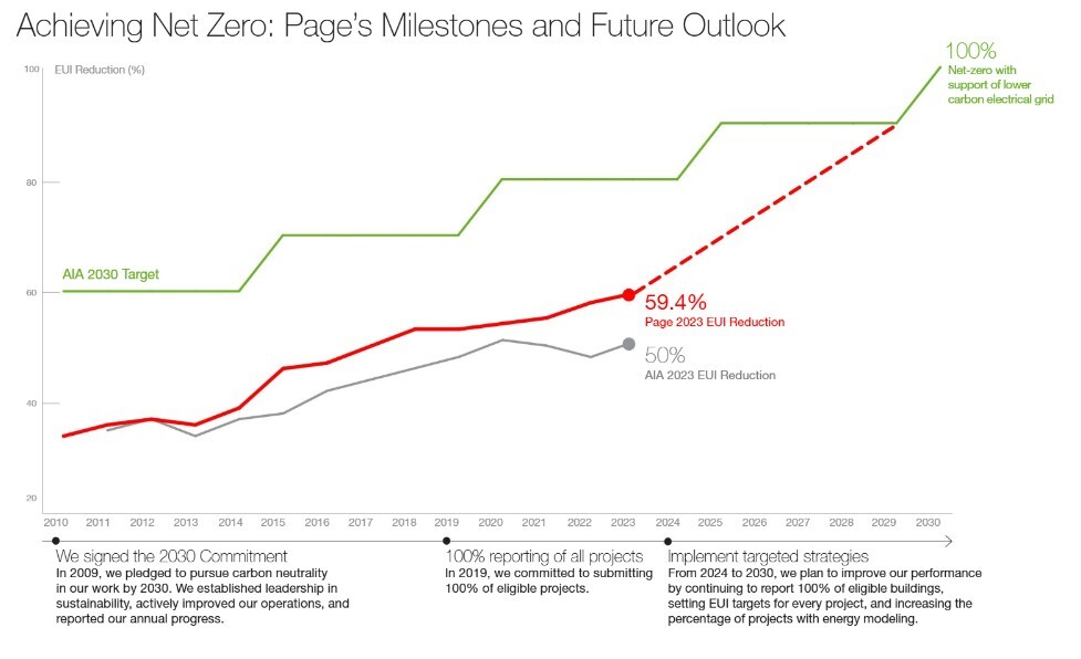
Making your message audience-tailored, actionable, and accessible
The backbone of an effective table, graph, or chart is a deep understanding of the context in which it’ll be shared. This starts with clearly identifying the audience’s perspective and developing a well-defined takeaway.
Ask: What does the audience care about? How familiar are they with this topic? Do they care about high-level or detailed data? Each question and its corresponding answer should influence the visualization’s design to effectively resonate with the audience.
For example, consider a client focused on meeting and exceeding local sustainability targets over the next 20 years. If they’re highly knowledgeable in this area and prefer detailed, analytical views, the right visualization may illustrate the cumulative carbon balance across 25 years, highlighting specific contributors and offsets.
Alternatively, for an audience that prioritizes high-level takeaways and is less familiar with the subject, a better approach is to present the same cumulative balance in a simplified form with clear labels explaining values and minimal technical jargon.
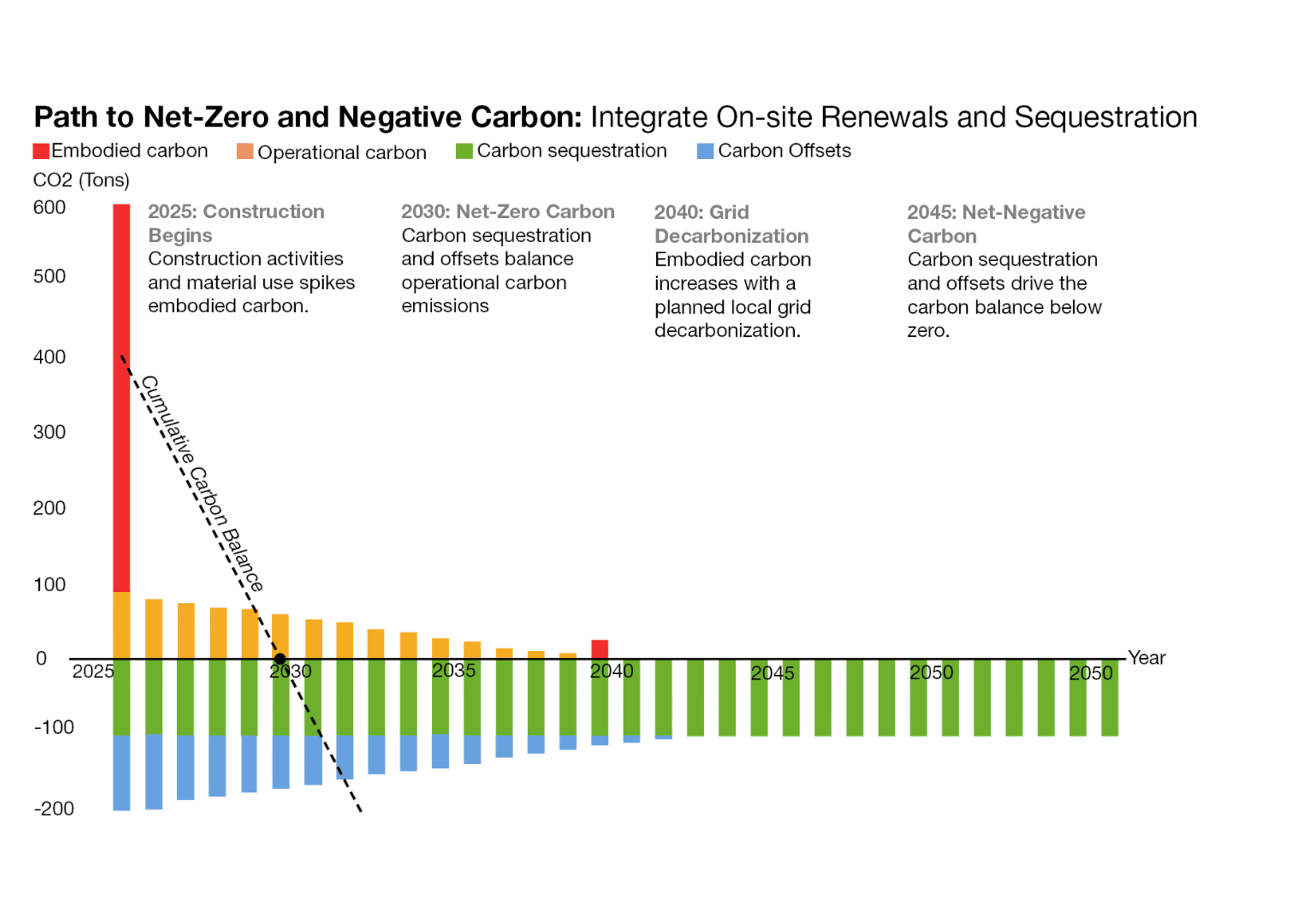
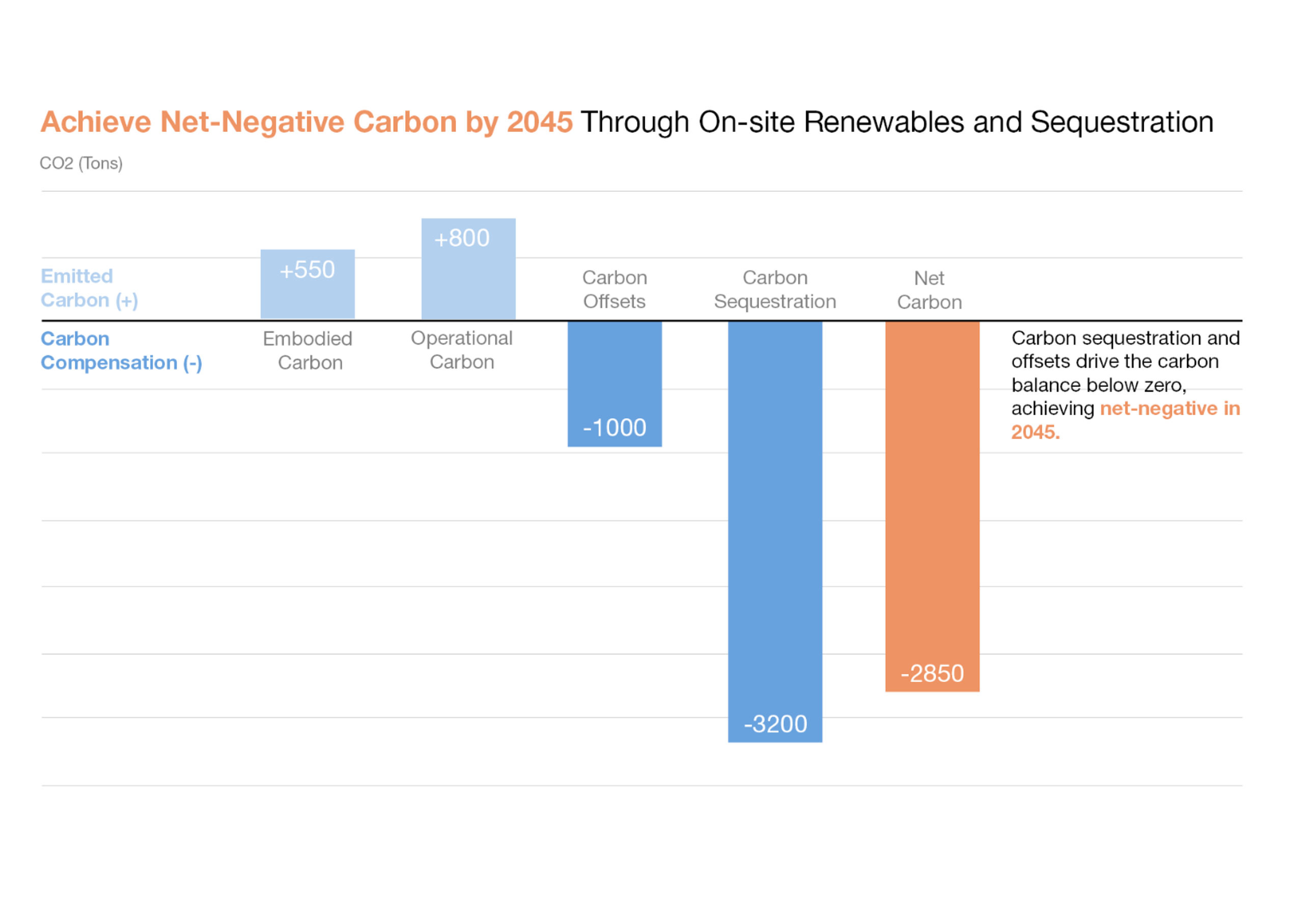
/
Once you understand the audience, consider: What action do they need to take? What specific insight should they walk away with?
With a clear key takeaway or recommendation, the audience is prompted to absorb the insight and decide whether they agree. That reaction not only invites deeper engagement but also helps cement the information in their memory.
A laser-focused data presentation
While tools like Excel make it easy for anyone to turn standalone values into visualizations, relying on its default settings often leads to undiscernible graphs. This visual noise comes from graphic elements that don’t support the legibility of your data, as the tool simply can’t interpret nuance or the specific insight you’re trying to convey. It also doesn’t know the audience or the end goal.
Think of every visual element, every mark on the page, as something the audience must process. By strategically using white space—a foundational lesson in both marketing and architecture education—and removing non-essential details like borders, purposeless data labels, gridlines, and other distractions, the data stands out and speaks clearly.
Once the clutter is cut, consider which details can be added to drive the message home. A deep understanding of data often creates the impression that analysis appears clear and intuitive. However, the audience holds a different perspective, making it essential to anticipate how the data presentation will come across. Clear annotations can help clearly express the main takeaway, while guiding details draw attention to the most significant points.
And when it comes to color, don’t use it just to be colorful. Adding color or contrast for variety alone creates visual noise. It results in “color chaos,” where the audience doesn’t know what’s important or where to look. That confusion limits the ability to discern the overall message.
Instead, choose one highlight color to deliberately draw their eye to the focal point. Let everything else recede into the background. This way, the most important information stands out and sticks.
So, whether proposing a new system, showcasing performance, or guiding a client decision, the data only works if it’s understood. Thoughtful, well-designed visualizations turn complex insights into clear, compelling narratives, minimizing confusion, aligning stakeholders, and accelerating smart decisions.

Talk with us
Complex challenges need fresh perspectives and deep expertise. Connect with our team to explore how we can help you create spaces that make a real difference.