People’s Community Clinic
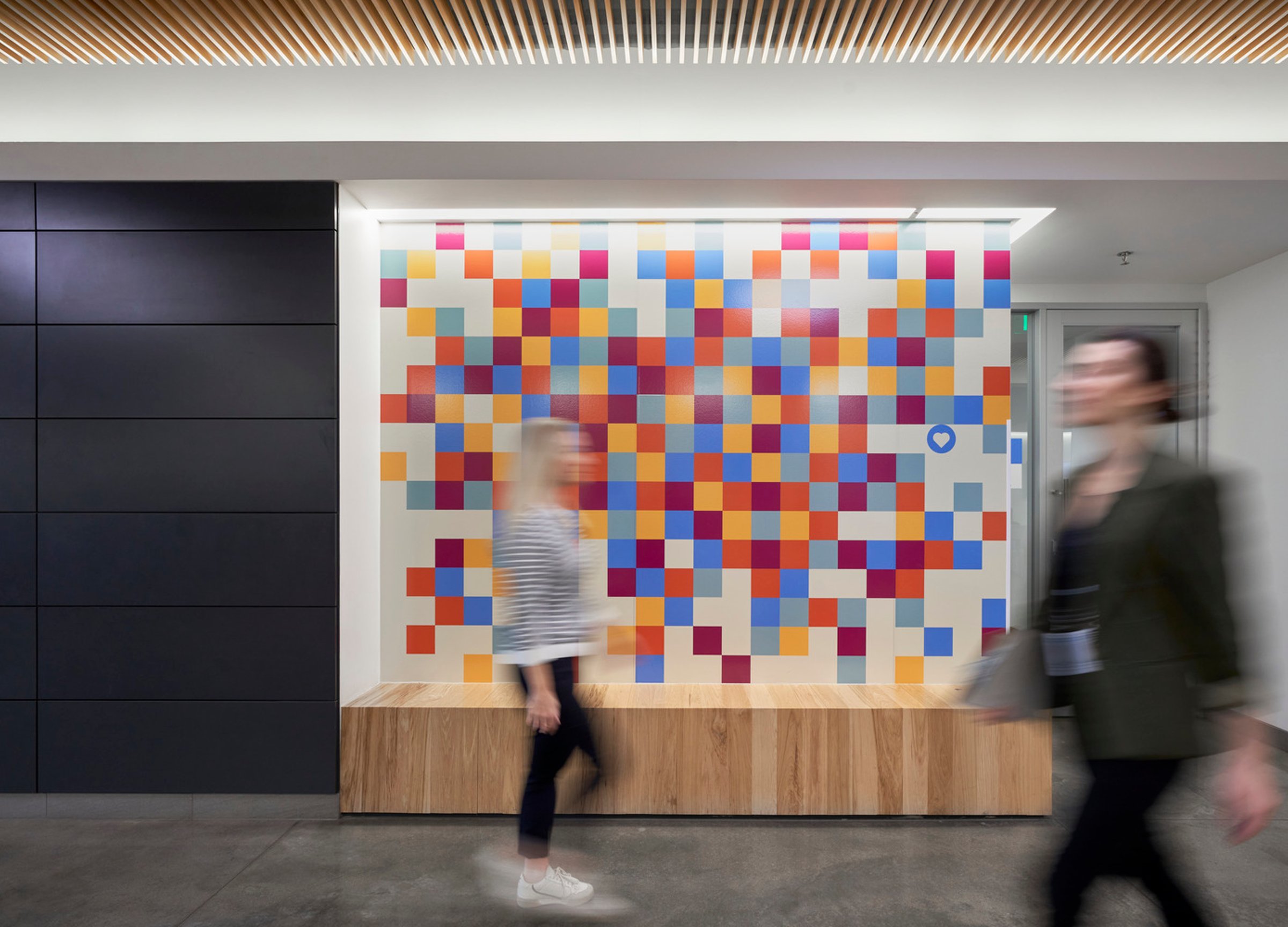
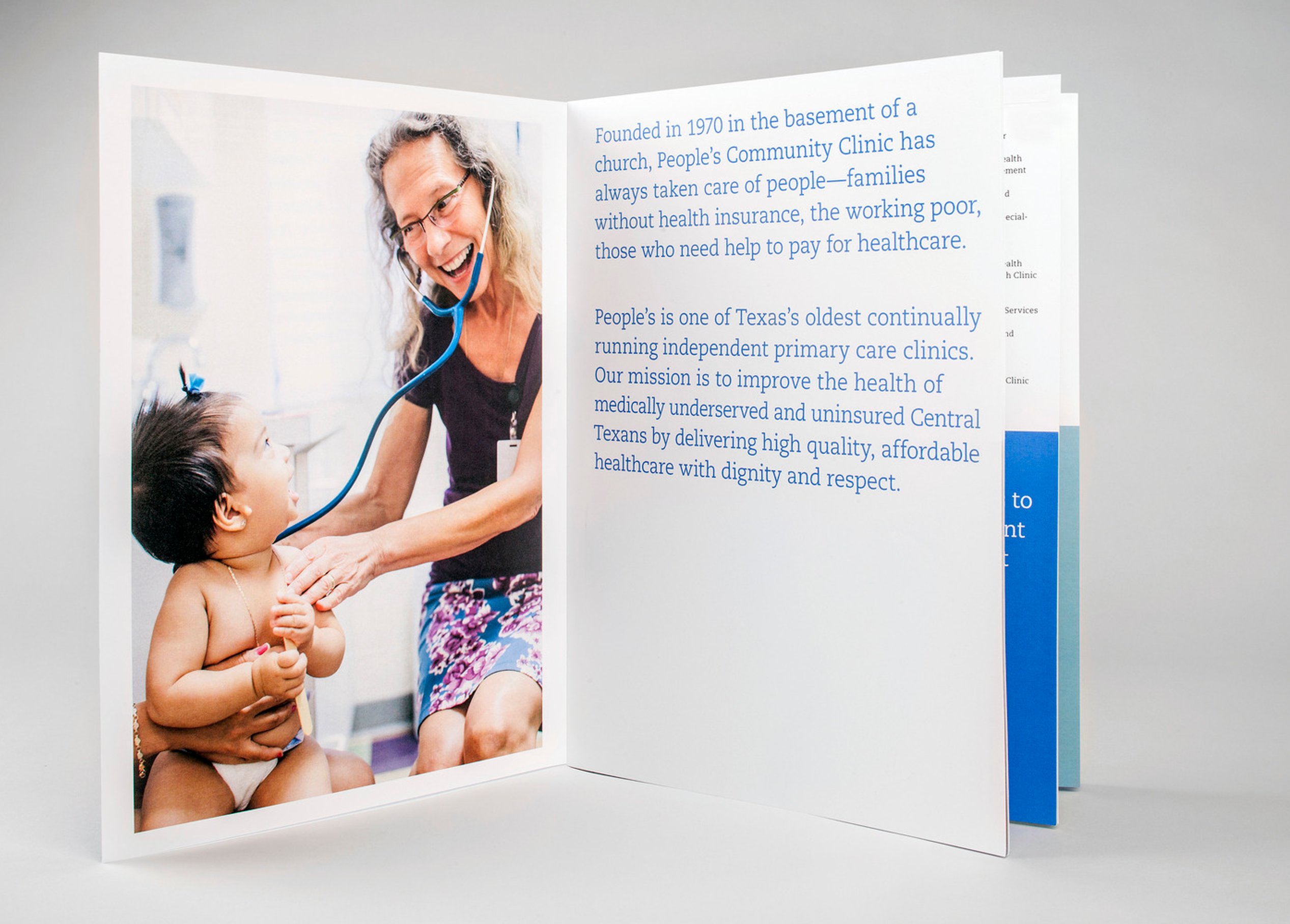
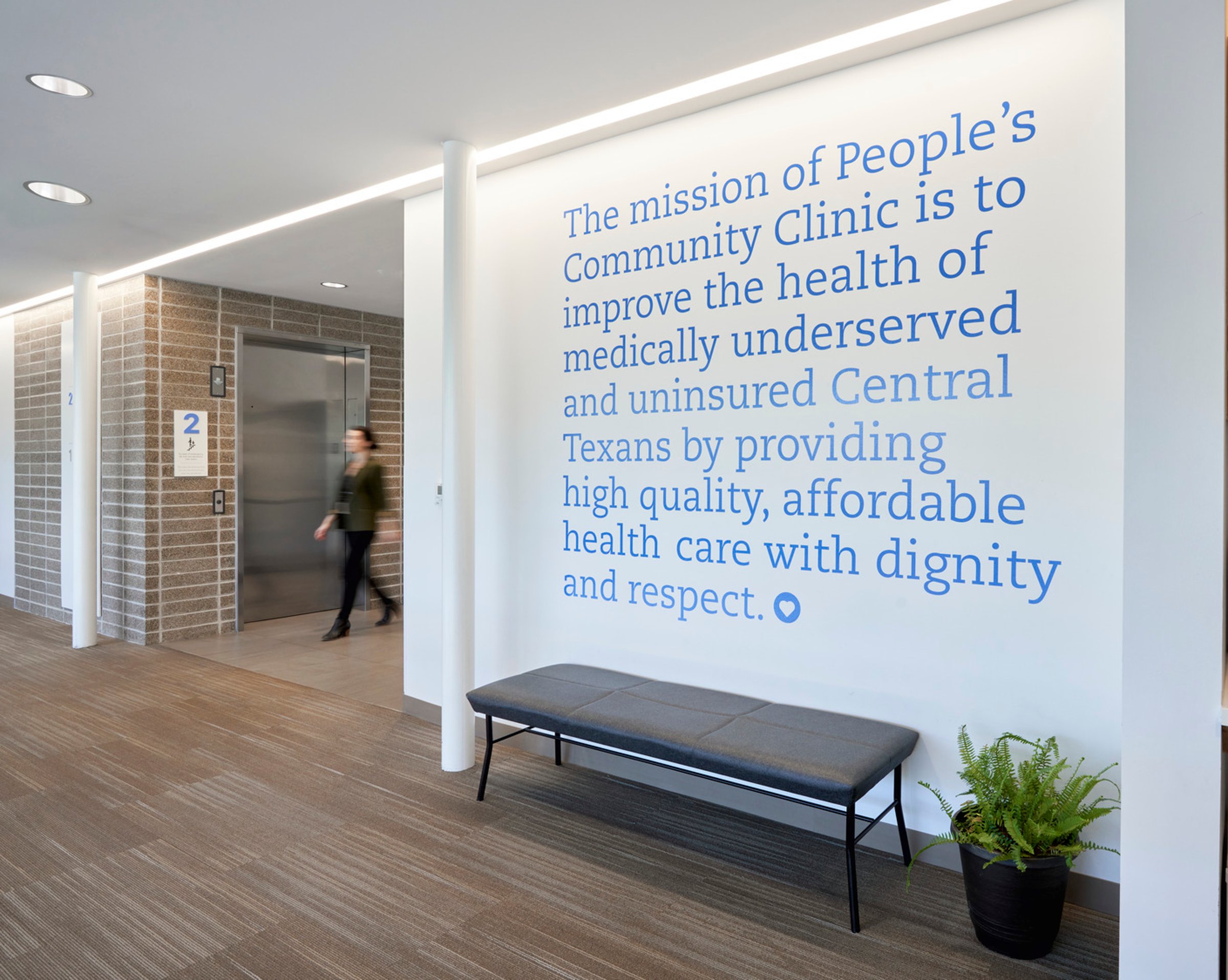
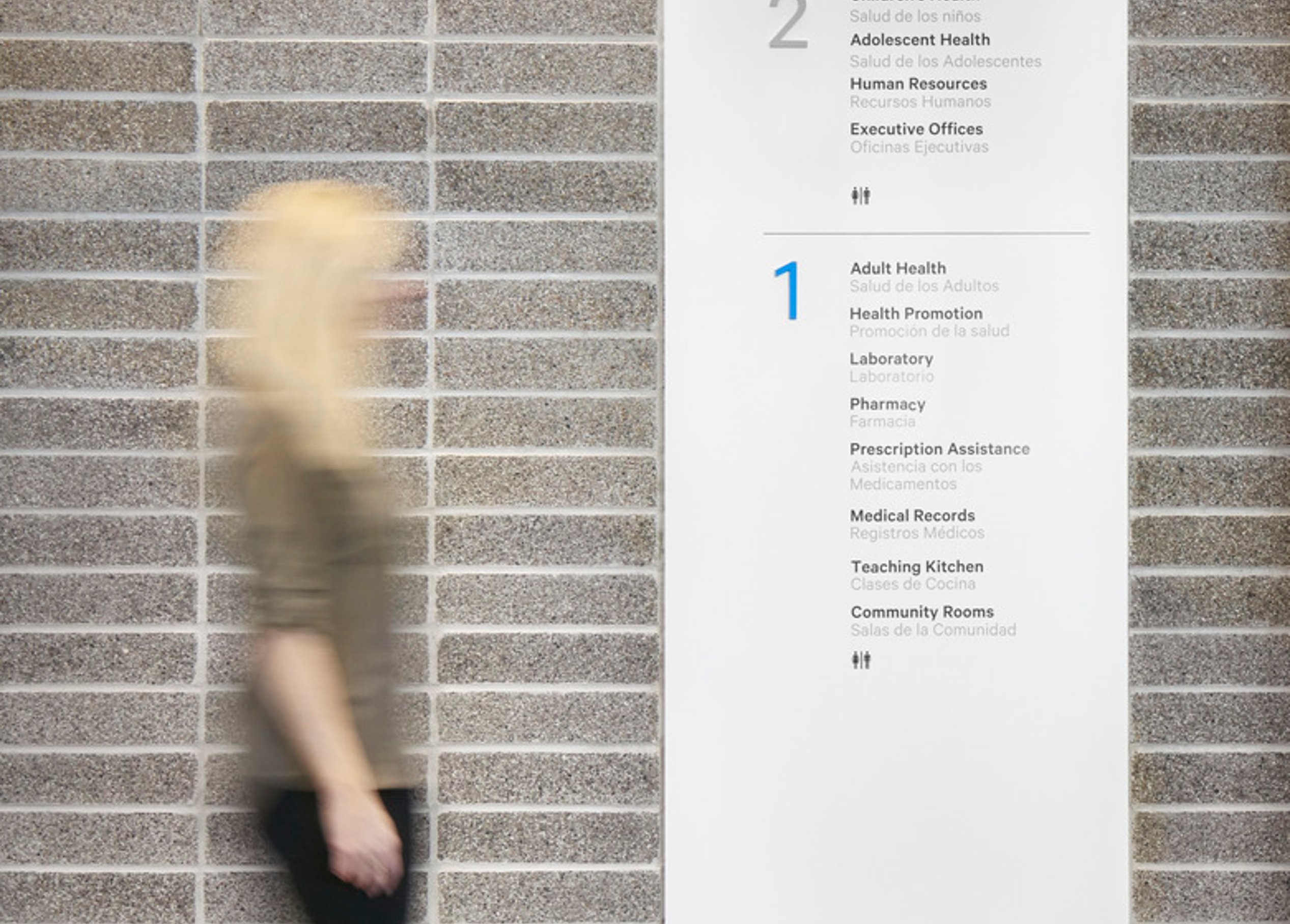
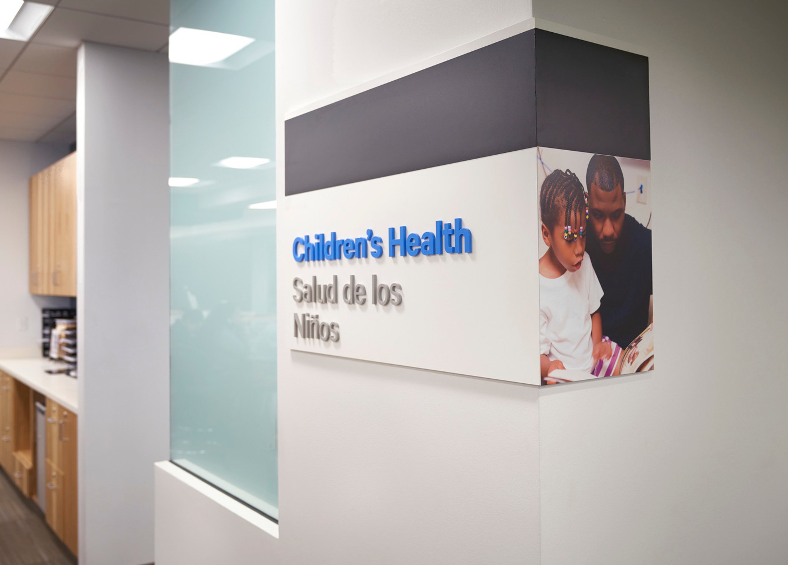
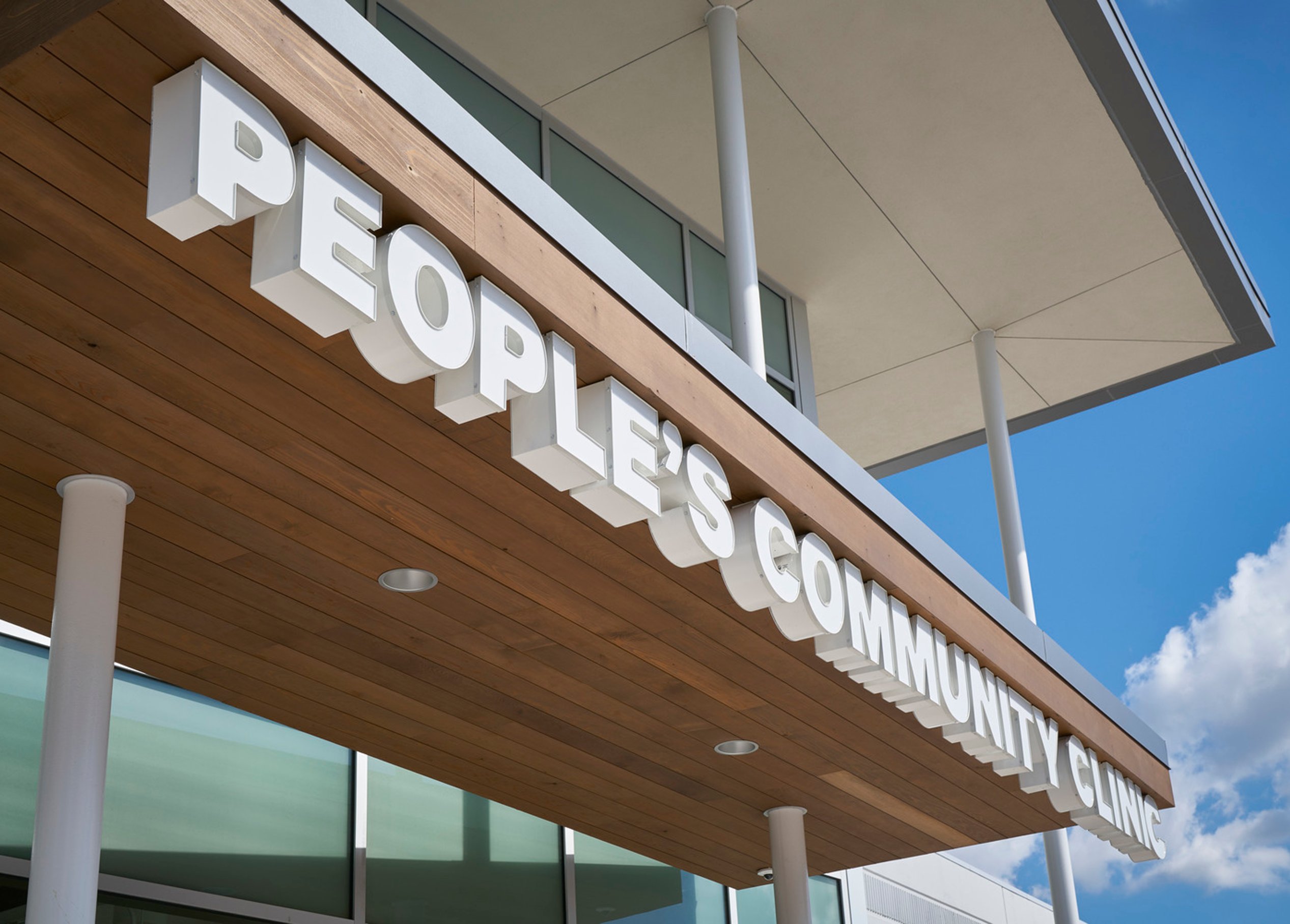
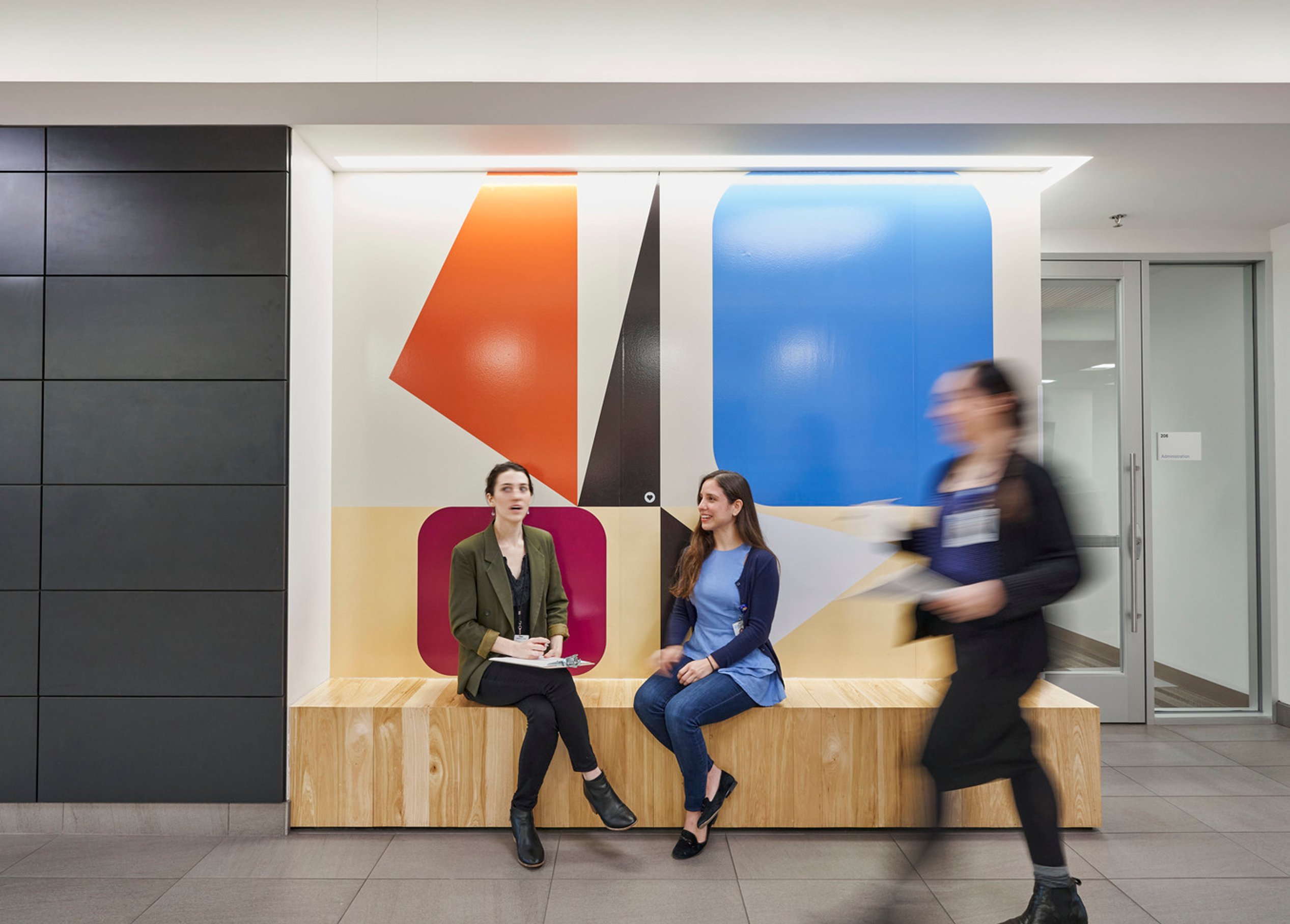
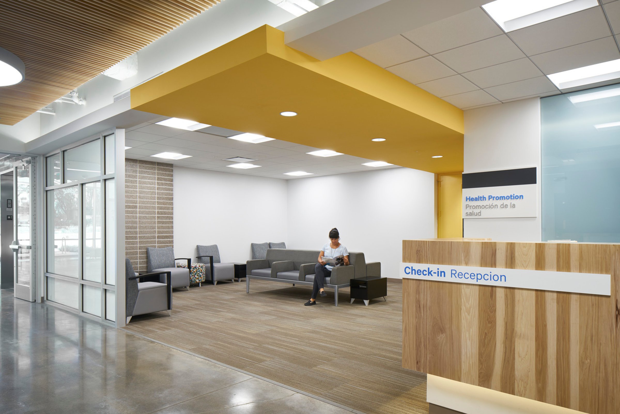
With humble beginnings as a free clinic in a church basement, People’s Community Clinic has been improving the health of medically underserved and uninsured Central Texans since 1970, providing high-quality, affordable healthcare with dignity and respect. As the clinic expanded its impact, Page helped shape its evolving identity—developing a new brand that reflects its mission and story while translating it into physical design elements, including signage and wayfinding, experiential graphics, and a donor recognition program for its state-of-the-art facility.
A new home
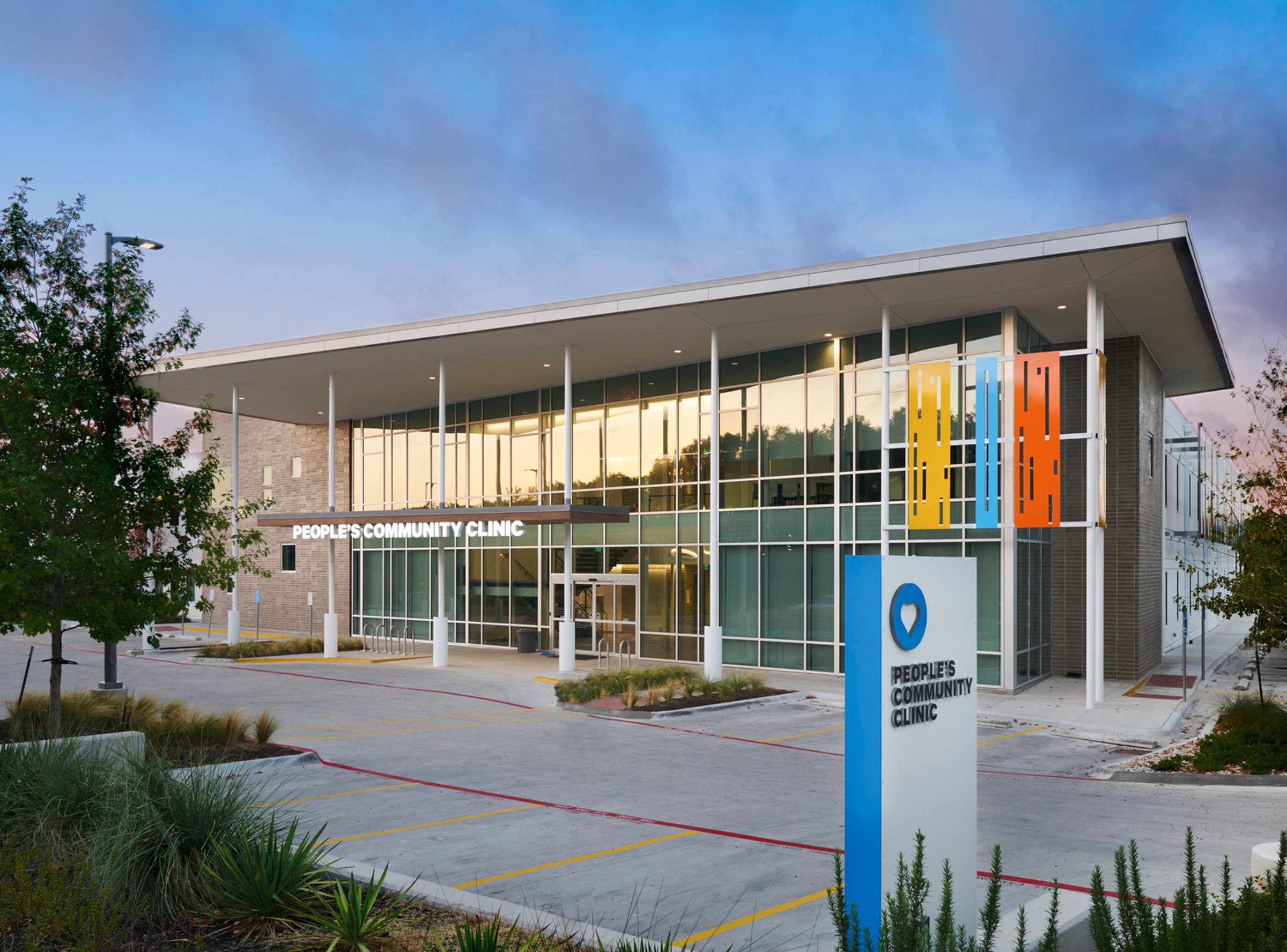
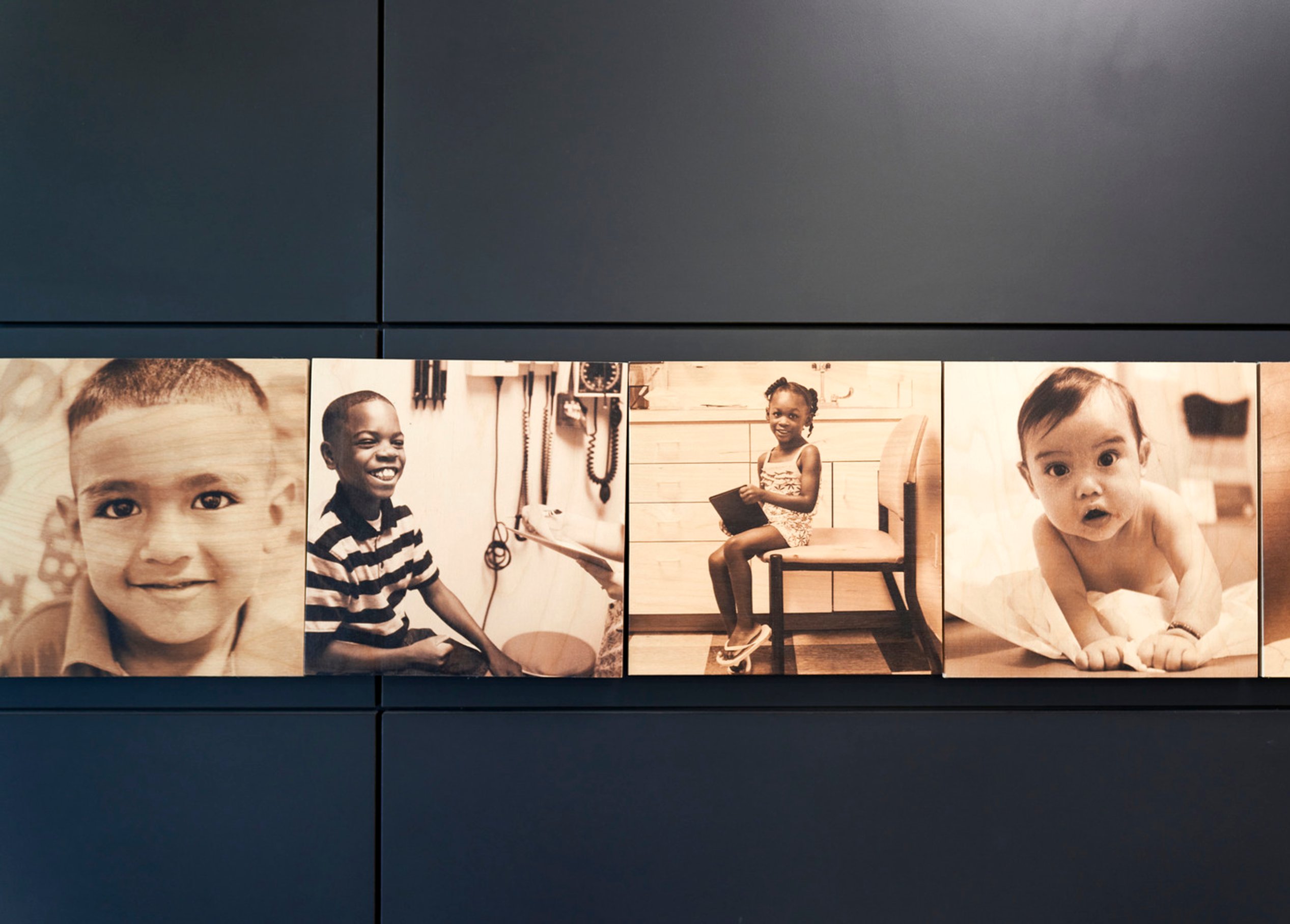
Thoughtful design guides visitors seamlessly while celebrating the community that makes the clinic’s mission possible—creating a space that feels as welcoming and compassionate as the care inside.
Brand and identity
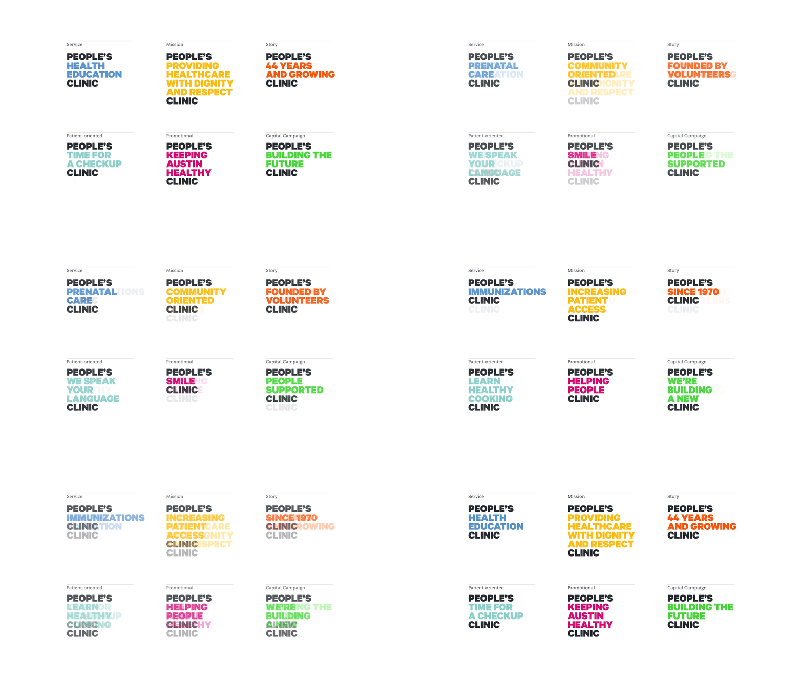
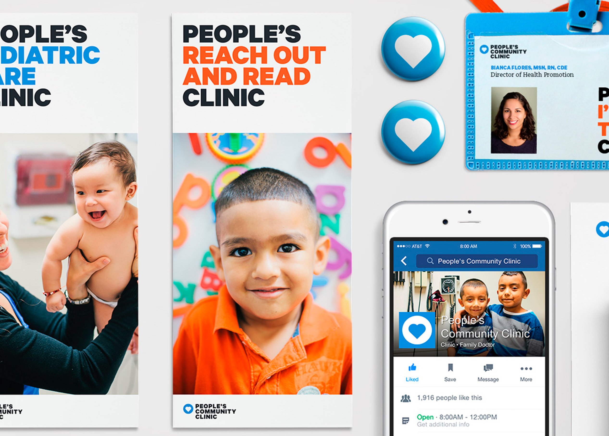
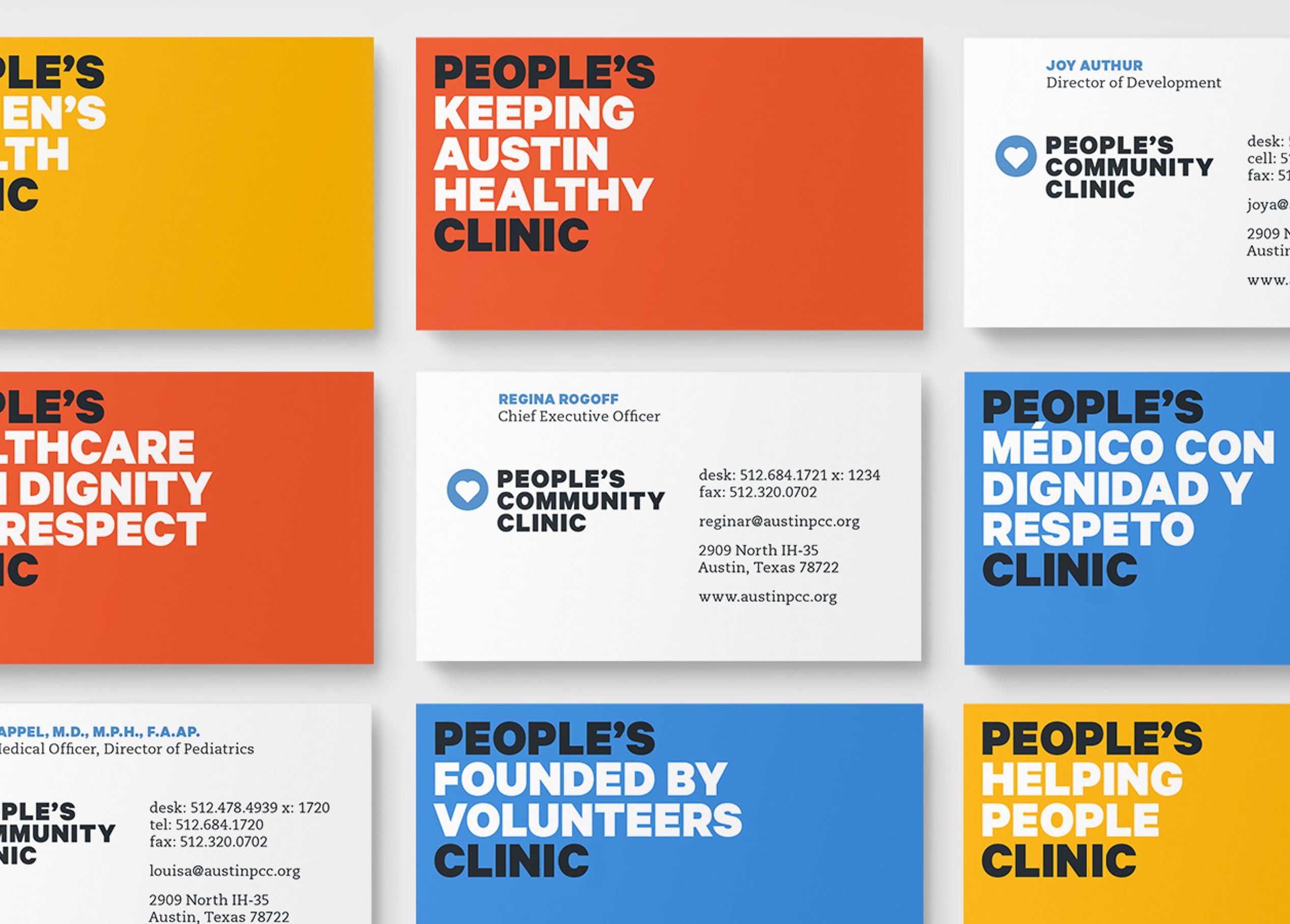
When People’s Community Clinic was founded, its logo featured a red heart at the center. During the brand refresh, it became clear that this heart was central to everything they do. To reflect this evolution, we introduced a fresh palette and bold typography that honors their decades-long journey.
While their deep connection to the community was well known, the full scope of their impact and services was less recognized. We developed a brand structure that enables tailored messaging focused on key aspects of their organization with clarity and purpose.
/
/
Honoring generosity, elevating care
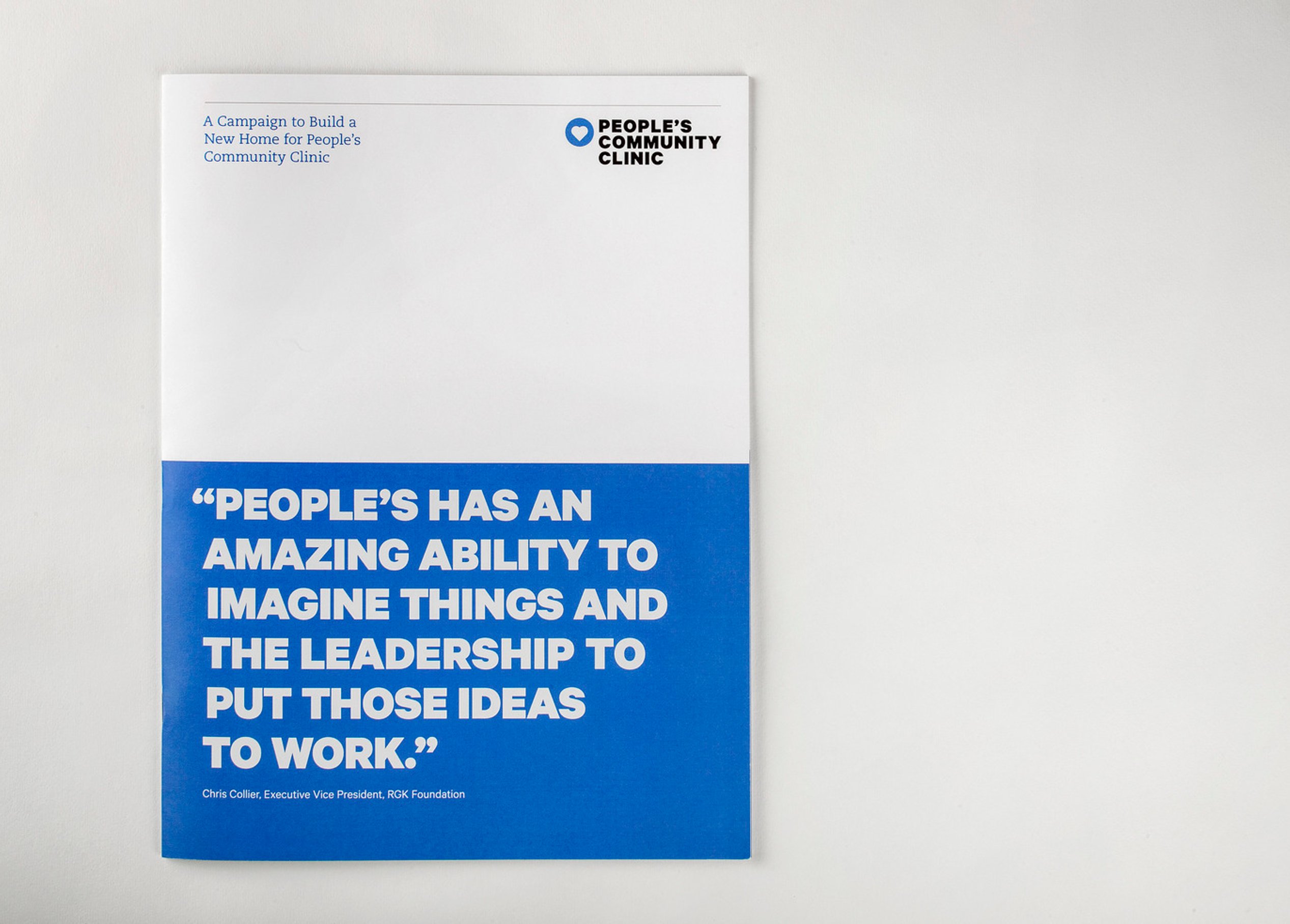
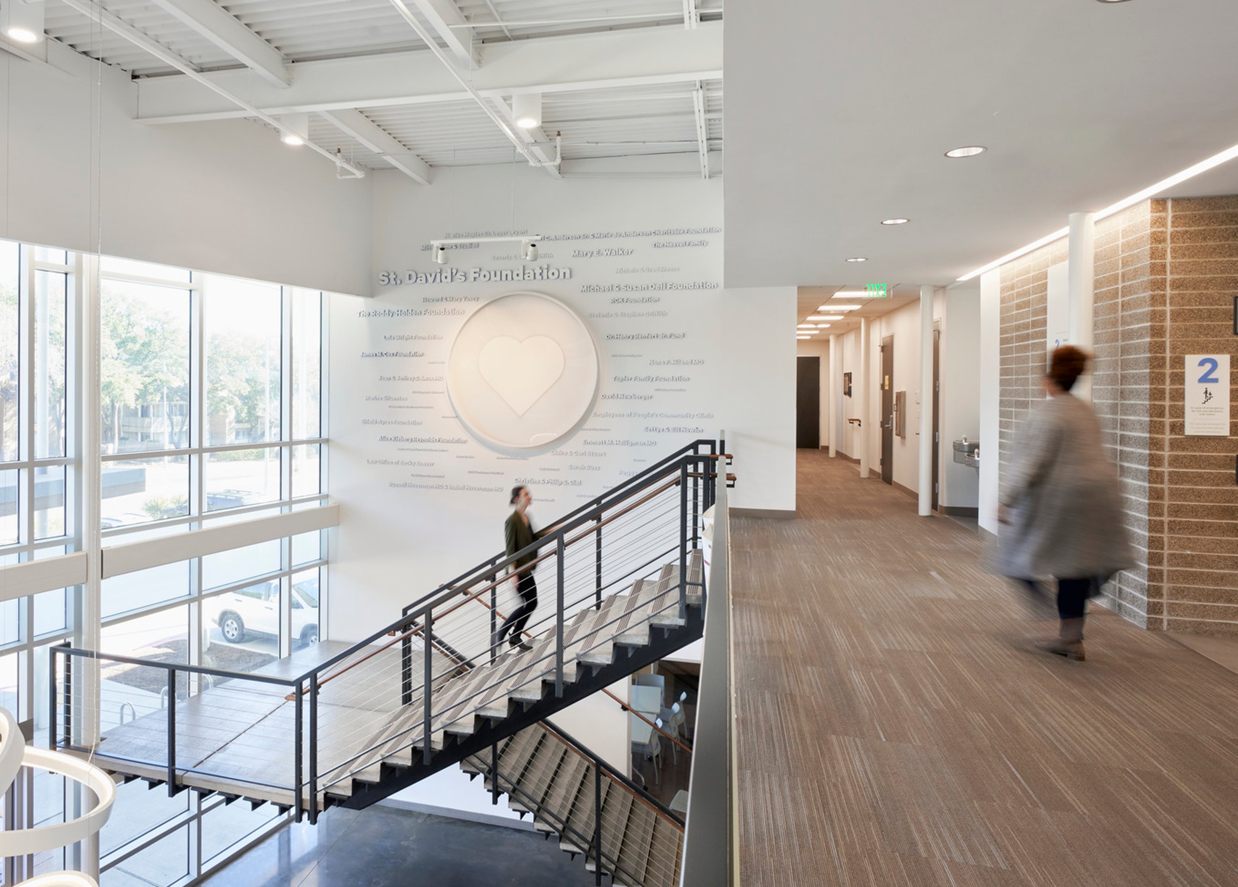
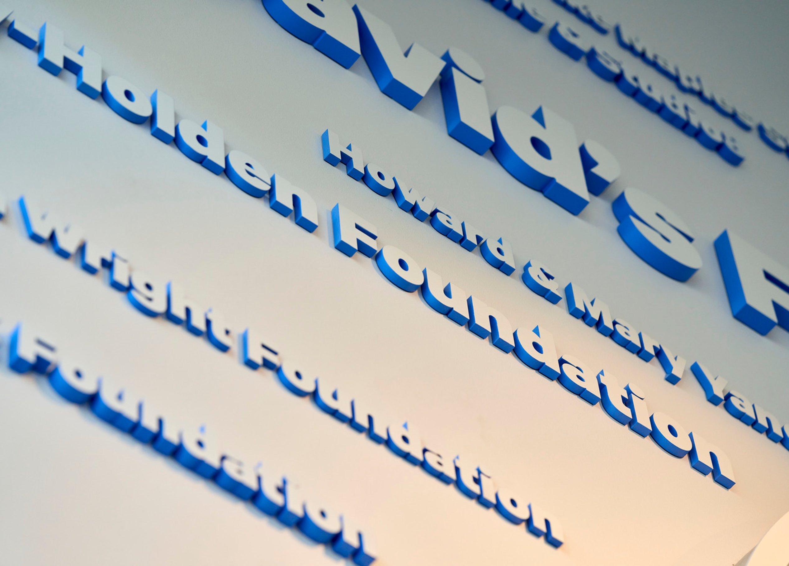
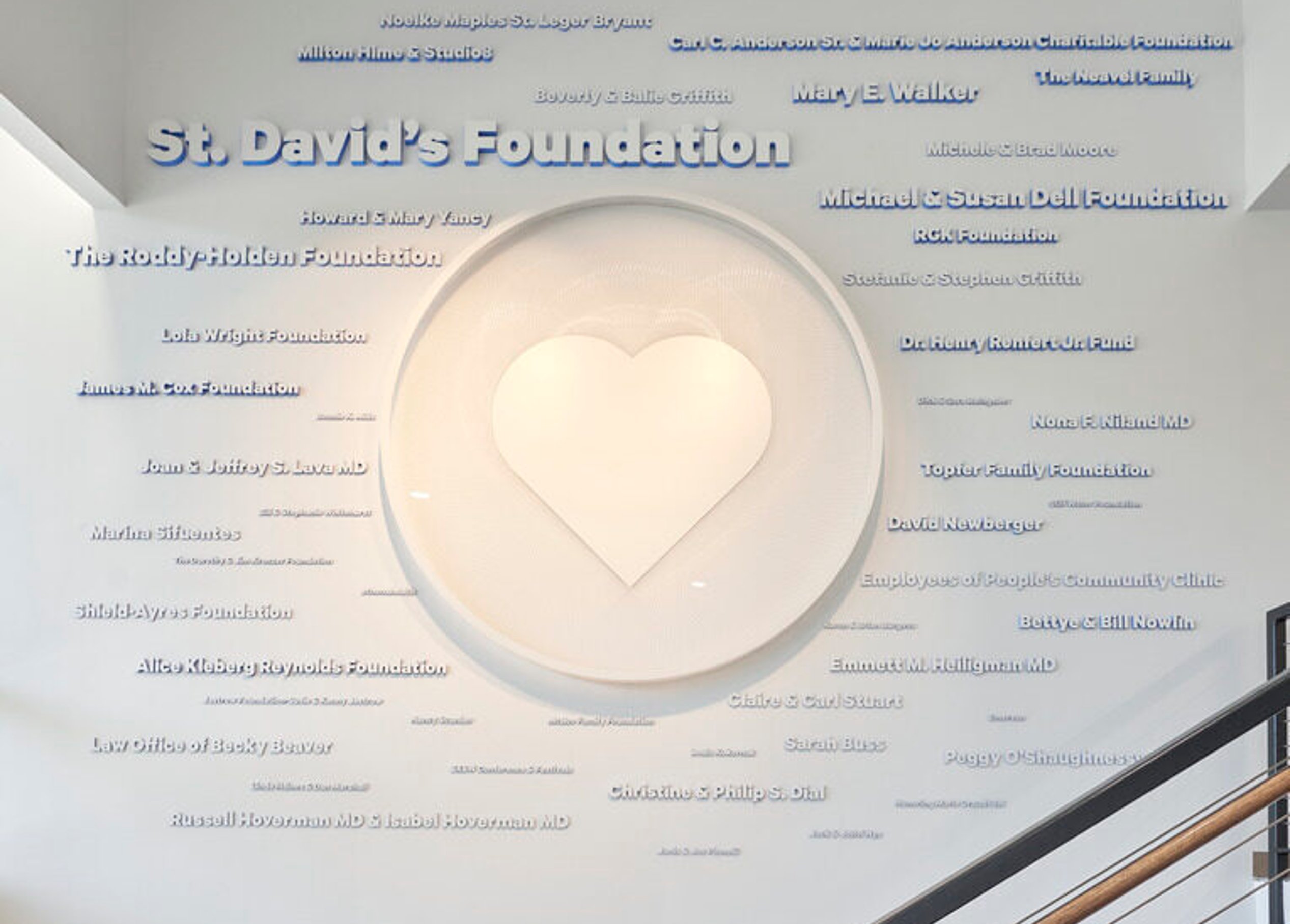
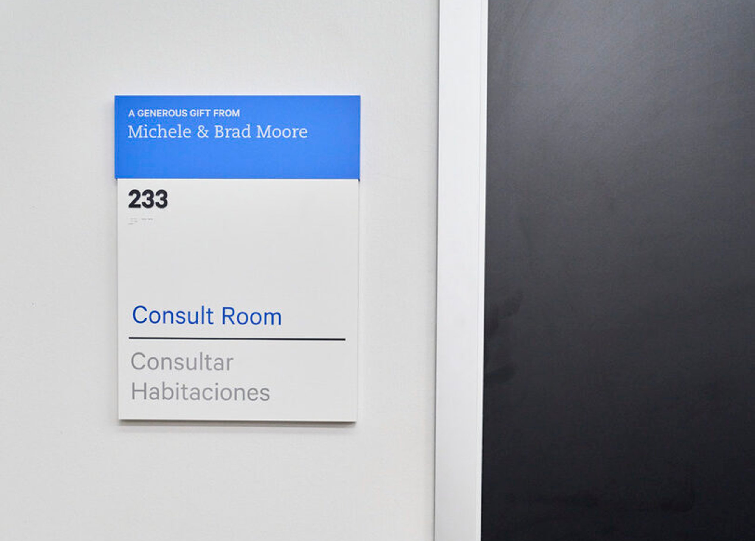
The donor recognition system honors supporters at every level through a blend of integrated elements—from room plaques to large-scale graphic installations. Each piece reflects the organization’s mission, seamlessly connecting donors to the spaces they help bring to life.
/
Similar projects



/

Talk with us
Complex challenges need fresh perspectives and deep expertise. Connect with our team to explore how we can help you create spaces that make a real difference.