
The University of Texas at Austin Identity
The University of Texas at Austin engaged Page to develop a unified and cohesive brand identity for its academic realm—one that could be applied consistently across all colleges and schools. Previously, each operated under its own unique identity, creating an inconsistent brand presence that failed to leverage the equity of the flagship institution within the University of Texas System.
In contrast, the university’s iconic Longhorn sports brand is instantly recognizable and deeply connected to its identity. The academic brand needed that same level of strength and cohesion—positioning UT Austin firmly within the community of tier-one universities.
To achieve this, we designed an academic logo inspired by the university seal, developed a distinct typographic system, and created a comprehensive, flexible framework for lockups and usage guidelines. The result is a brand that brings clarity, consistency, and prestige to UT Austin’s academic identity.
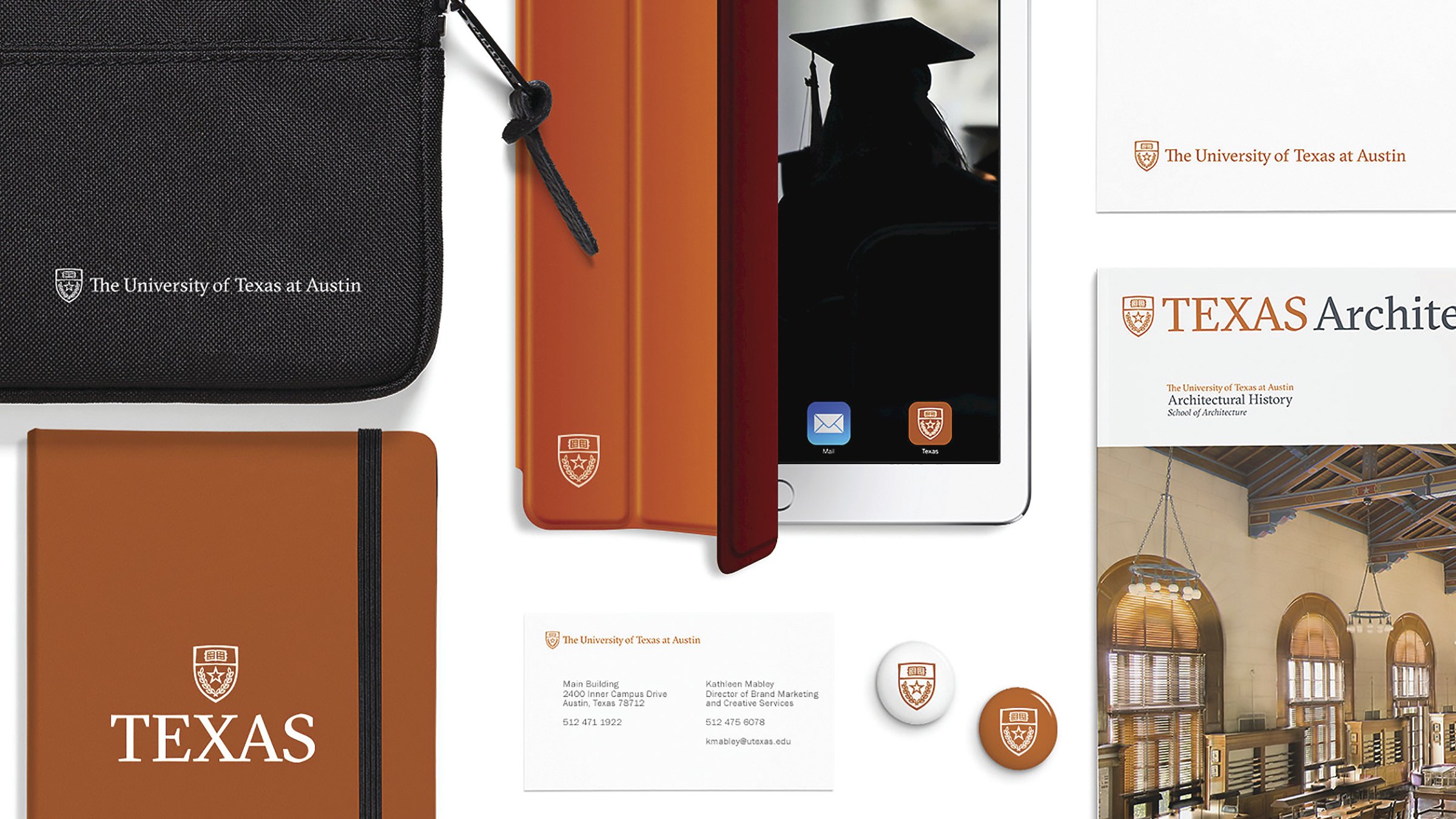
The University of Texas at Austin’s academic identity lacked cohesion, with each college and school operating under its own visual brand. We developed a unifying system—spanning 19 colleges and reaching 52,000 students—that elevates the university’s academic reputation while complementing its instantly recognizable Longhorn spirit.

The primary mark is derived from the university’s official seal, with each element thoughtfully designed to reflect the school’s identity. At the center, the Texas Lone Star is surrounded by simplified oak and olive branches, symbolizing strength and peace. The leaves represent the university’s colleges, while the rhythm of the abstracted words in the Book of Knowledge subtly echoes a phrase from a school song. Every detail carries meaning, connecting tradition with design.





/

A flexible and streamlined system
The new identity system was applied across all colleges, departments, and units. Designed for flexibility, the logo system offers multiple lockups to accommodate varying levels of formality and hierarchy within the university. While adoption wasn’t mandatory, the system has been universally embraced by all colleges.
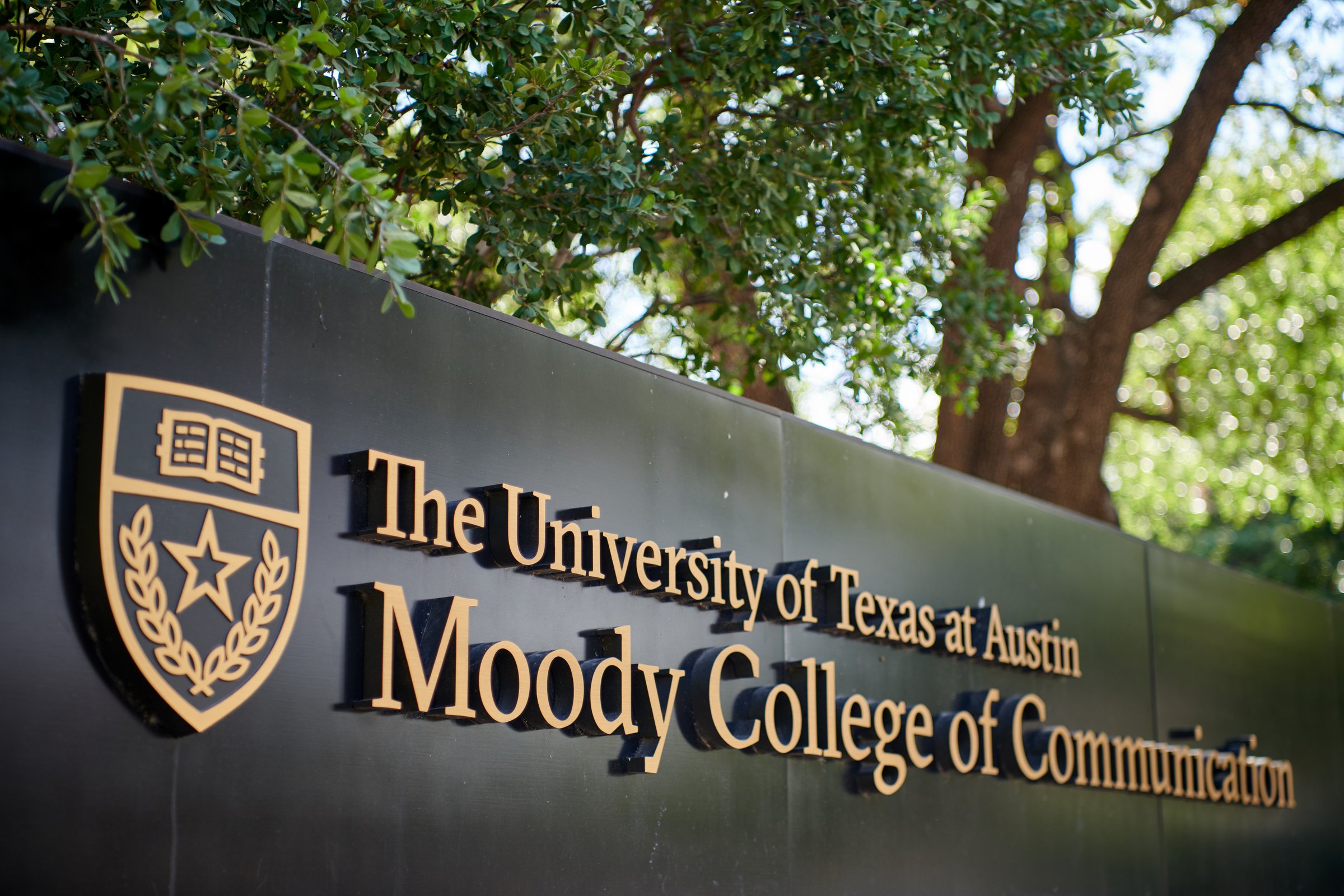

Chiseled in stone
We designed a new formal entrance to the campus at University Avenue that carries the wordmark. The entrance serves as a plaza and a popular photo-taking opportunity for graduates and visitors.

Similar projects




/

Talk with us
Complex challenges need fresh perspectives and deep expertise. Connect with our team to explore how we can help you create spaces that make a real difference.