
Feature
November 6, 2025
Effective cost control: How understanding variation boosts performance
by Jennifer Wegner
Listen to this story
AI powered reader
/
Top executives at Real Estate Company XYZ are struggling with a persistent problem in an older building in their portfolio. For the past four months, HVAC issues in Downtown Building A have continued despite repeated meetings and attempted fixes. Replacing the system isn't an option due to budget constraints, so leadership must work to restore performance with existing resources. However, the system's performance continues to decline, tenant dissatisfaction is increasing, and some tenants are now threatening to terminate their leases. Repair costs are rising, yet a sustainable solution remains out of reach.
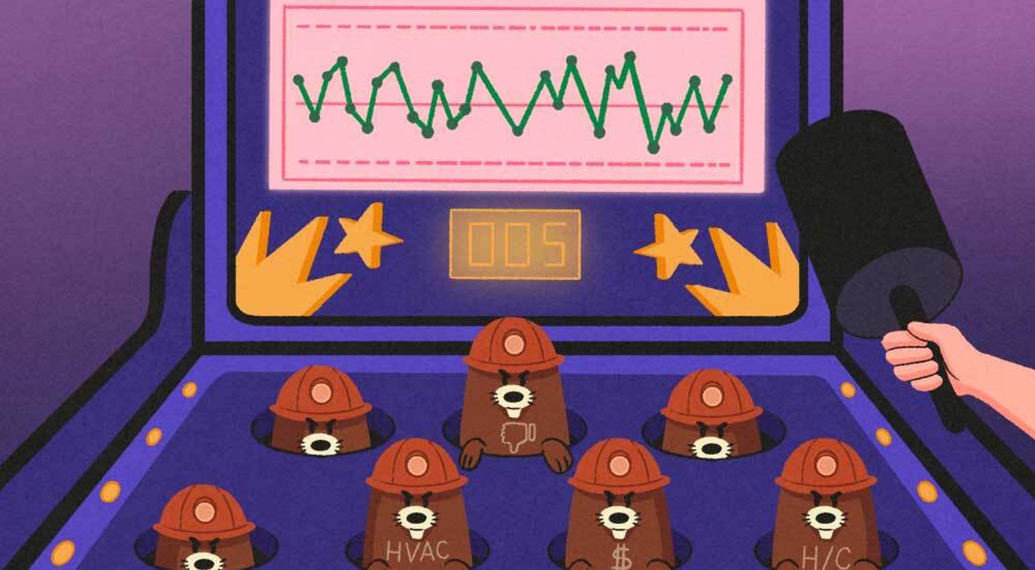
This pattern feels all too familiar, much like the arcade game, whack-a-mole, where every reactive move is met with another emerging problem. Unfortunately, but predictably, the player never wins in this game. And, despite the leadership’s commitment to finding a resolution to their malfunctioning HVAC system, their efforts so far have delivered short-term relief at best.
How can company executives and facility operators (henceforth known as “leaders”) effectively address this challenge? Should they bring in outside experts or reorganize their maintenance team to find the true source of the problem? The answer lies not in guesswork or quick fixes, but in a shift in perspective, and the solution is simpler and more elegant than it initially seems. When long-term data is available, the real breakthrough comes from understanding the nature of variation and recognizing whether the problem stems from predictable, common cause variation or exceptional, special cause variation to achieve the desired system performance.
Understanding variation to make smarter decisions
Persistent issues in building operations, service delivery, or manufacturing often cause leaders to adopt a reactive approach, addressing problems as they arise. However, without a structured framework for analyzing data patterns, this whack-a-mole method can lead to inefficiencies, cost escalations, and diminished trust.
An effective strategy begins with a comprehensive understanding of process variation and the ability to differentiate between normal fluctuations and genuine anomalies. This insight enables leaders to implement targeted interventions, allocate resources efficiently, and enhance overall system performance.
In this case, the team has collected two months of daily HVAC usage data from Building A. The management team’s goals are clear: reduce operating costs, improve occupant satisfaction, and enhance the HVAC system’s reliability. So, where does the team start? Fortunately, there is an analysis technique that will help the team unravel the complexity of the results, leading to cost-effective solutions. The key is knowing where to start, and in this case, gathering data from the HVAC system is the best place to begin.
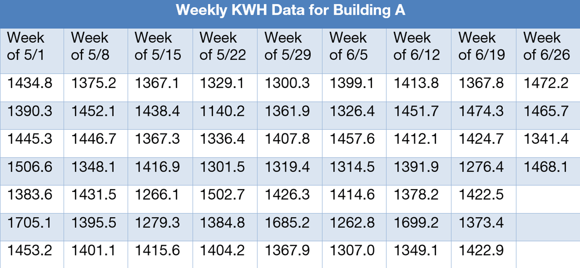
The data that Building A’s maintenance team collected after their initial attempts to fix the HVAC system failed. Using the appropriate analysis tool with this data will determine how and when the leaders at Real Estate Company XYZ and Building A should or shouldn’t react to the daily HVAC data. When data is presented in this format, it is hard to detect signal from noise, making it difficult for management to make decisions.
The nature of variation
Variation is constant in any system. No two measurements, processes, or outcomes are exactly the same. Every metric fluctuates but understanding why is vital for leaders. By knowing this principle, leaders can leverage this phenomenon to their advantage. Some variation is normal and expected; other times, it signals a deeper issue. Knowing the difference is critical. Leaders who grasp this concept can avoid unnecessary interventions and focus on changes that yield meaningful improvement.
What is a control chart?
A control chart is a visual tool that displays data over time to help interpret the data by distinguishing between meaningful signals and random noise. By plotting performance data over time, a control chart can identify two distinct types of variation:
- Common cause variation: This is inherent in any system. It reflects routine fluctuations caused by factors such as a building’s occupancy, seasonal weather events, thermostat requests, or, in other cases, workflow complexity, or staffing levels. Data points due to common causes fall within the predictable range, known as the control limits.1
- Special cause variation: This reflects disruptions or anomalies that are not usually part of the system. Special cause variation is an unusual event that differs from the constant common cause variation, like equipment failure, an extreme weather event, or supplier failure.2 Data points that fall outside control limits are called special cause variation and, when correctly identified, can be very helpful in understanding the capabilities of system outputs.
Control charts help leaders distinguish between the two types of variation and make smarter decisions about when and how to act. This methodology helps leaders act more responsibly and efficiently, avoiding the costly game of whack-a-mole. The key point is that mistaking one type of variation for the other results in poor decision-making.
Understanding a control chart
A control chart consists of:
- A centerline, representing the average (mean) of the dataset
- Upper and lower control limits, calculated statistically based on the natural variation in the dataset
Points that fall inside the control limits represent a stable system, and points that fall beyond the limits are considered to represent special causes.
These limits are not targets but are scientifically calculated using standardized formulas. These data-driven thresholds help indicate whether a change is meaningful or just part of the system’s normal rhythm.
Numerous software tools can generate control charts using built-in formulas. These tools are accessible and user-friendly, allowing teams and leaders to analyze data without requiring extensive statistical expertise.
Why control charts matter
The advantages of utilizing control charts for data analysis and visualization significantly surpass the reliance on manual interpretation of data tables, which can be susceptible to human bias. Accurate interpretation of these charts enables more informed, confident decision-making by team members. Furthermore, it boosts organizational morale by aligning leaders’ focus with critical issues (signal), rather than chasing random fluctuations (noise), and thus drives strategic success. Control charts help leaders by:
- Avoid overreacting to common cause variation
- Identify when real problems emerge (special cause variation)
- Prioritize improvement efforts
- Reinforce credibility by responding to issues with precision
By effectively managing control charts, businesses become more deliberate, consistent, and effective in managing operations and pursuing performance goals.
Recognizing stability and signal
The interpretation of a control chart is also fairly straightforward. If all points remain within the control limits, the data suggests a system that is stable and predictable. In such cases, no special action is necessary. (Incidentally, there are other types of “out of control” situations that still indicate unusual behavior even when all the points are within the control limits, but these are beyond the current discussion. Software programs are usually capable of performing these calculations.)
A point that falls beyond a control limit highlights a situation that requires investigation. Intuitively speaking, control limits guide the leader to not accrue losses from mistakes by reacting (i.e., investigating) when they shouldn’t and not reacting when they should.1 The statistical formulas that define these limits are designed to minimize the losses associated with those inevitable missteps.3
For an Individuals-type chart, the statistical formula3 would look like this:
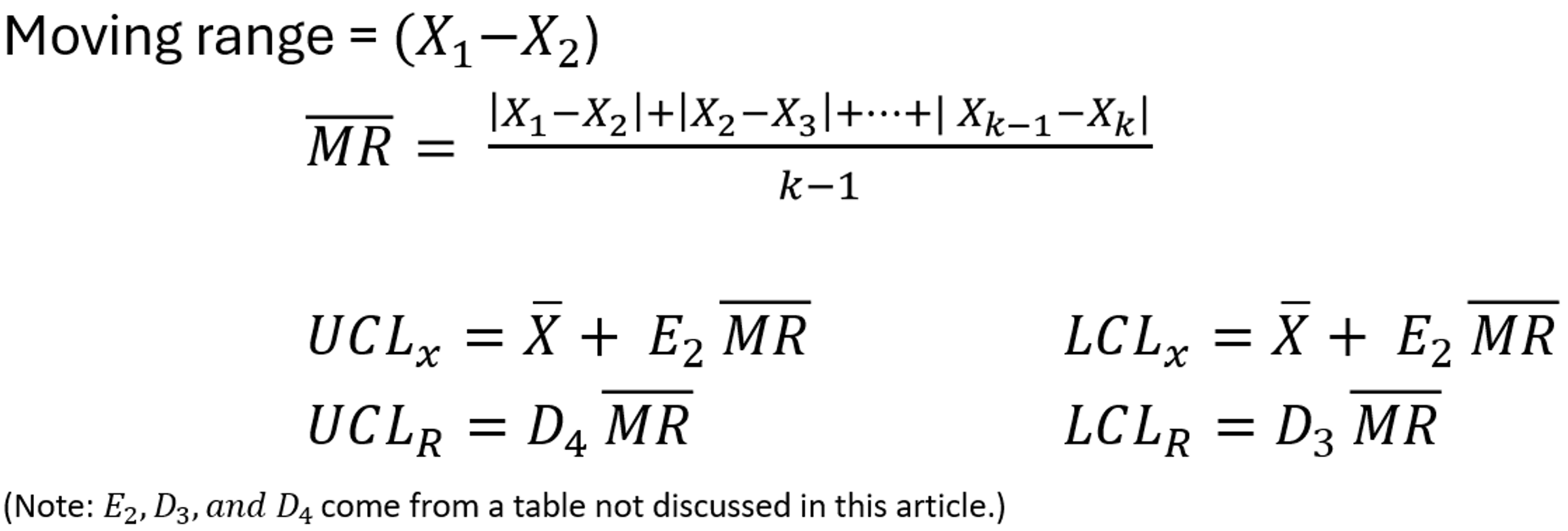
By using control charts, effective leaders apply principles of science in decision-making rather than making arbitrary and capricious choices.
When to act and when to hold steady
Reading a control chart involves asking two key questions: Are the data points within the control limits? And if so, in this case study, is the HVAC system performing as expected?
If all points fall within control limits, the HVAC system shows common cause variation, indicating a stable (predictable) process. To improve the system based on common cause variation, leadership should focus on raising the average output by examining the common factors affecting the system as the source of undesirable results.
If leadership overreacts to a high point or low point (to a point that is not “out of control”), then “tampering” occurs. Tampering is harmful because it leads to increased variation in the future and creates more whack-a-mole problems. It’s the management equivalent of oversteering: the harder the steering wheel is turned, the more off-course the car goes. As the saying goes: “Don’t fix what isn’t broken – and don’t ignore what is.”
Spotting special cause variation
When a point falls outside an upper or lower control limit, it’s necessary to identify the cause and respond immediately. This indicates a special cause variation, an event or factor that is outside the normal system behavior. In this case, an investigation is warranted in Building A (see charts below).
Responding to special cause variation is both cost-effective and essential. It allows leaders to address real issues, avoid unnecessary guesswork, and focus their attention on where it matters most. Identifying and resolving these anomalies not only protects performance but also prevents future disruptions. When a special cause is identified, it’s cost-effective to act.
Balancing overreaction and underreaction
Smart leaders and facility operators should recognize the costs of overreacting and underreacting. Overreacting to common cause variation, like switching vendors after a small dip in output, can cause confusion, inefficiency, and potentially lower morale. Ignoring special causes might prevent learning opportunities, obstruct root cause analysis, or unnecessarily complicate issues.
Control charts provide a clear way to interpret performance. They help leaders pause before reacting, identify the difference between noise and signal, and respond based on data rather than gut feelings.
Converting table data into a control chart
Below is the accumulated data from Building A, shown earlier as a control chart but without control limits. The data presentation is clearer but still lacks informativeness. At least 10 points are high. Which point should be investigated first? Second? Third? What about the lower points? Where do they fit into the analysis scheme? The point is: If you have no destination in mind, any road will take you there.
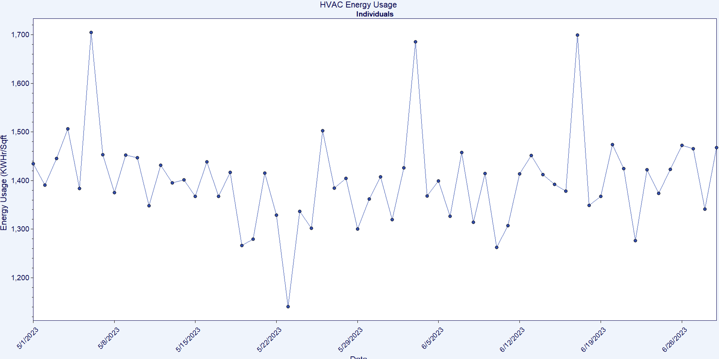
Now, control limits and a center, or mean line, have been added. The chart below presents the upper and lower control limits as red dashed lines.
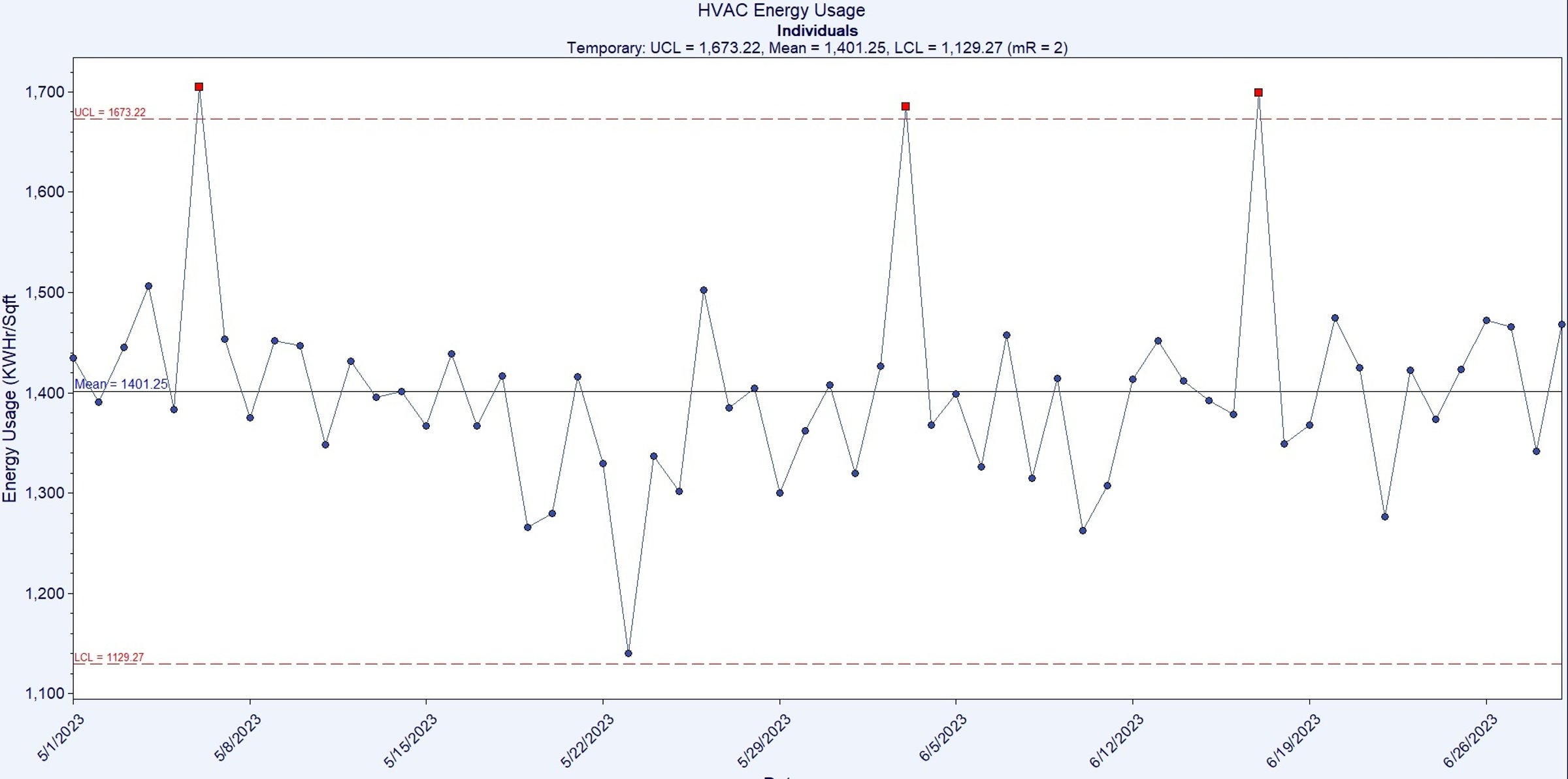
Now the chart is complete and indicates signs of special causes, specifically on May 6, June 3, and June 13. The analysis was timely, quick, and informative. Something noteworthy occurred on these dates, and resources should be dedicated to discovering what happened. Spending time investigating all other points only wastes the team's time and effort. The team needs to focus on what happened on those specific days first, as they are different from all other days. Conducting a thorough situation analysis to identify the root causes is now the right course of action in this case study.
Institutionalize improvement by using control charts
For Real Estate Company XYZ, the first step is to start with good data. Set up a system to monitor key performance indicators. Choose relevant metrics, e.g., indoor air temperatures, tenant comfort, service personnel on duty, response time, time of day, etc. Now that Real Estate Company XYZ understands there are three data points outside control limits, it’s time for their leaders to investigate the special causes and ignore the data within the control limits for now. The initial goal is to stabilize the unpredictable variation that the HVAC system in Building A is producing.
Reacting, or not reacting, that is the question
Understanding variation and knowing how to interpret control charts is more than just a technical skill; it’s a leadership discipline. By identifying whether a situation results from common or special cause variation, leaders can prioritize actions that improve system performance without causing unintended consequences. Playing whack-a-mole might be an entertaining children’s game, but playing this game when expensive, reality-based problems need to be solved can be frustrating. Successful leaders focus on targeted problem-solving. Using control charts transforms guesswork into insight and boosts productivity and performance. The path for Real Estate Company XYZ doesn’t start with quicker reactions; it begins with better judgment.
References:
1.
Deming, W.E. The New Economics for Industry, Government, Education. 2nd Edition. 1994. Cambridge, MA. MIT Center for Advanced Engineering Study.
2.
Deming, W.E. Out of the Crisis. 2018. 2nd Edition. Cambridge, MA: The MIT Press.
3.
CHARTrunner. (September 2002). Productivity Quality Systems, Inc. User guide.
More



Talk with us
Complex challenges need fresh perspectives and deep expertise. Connect with our team to explore how we can help you create spaces that make a real difference.