
Scout Strategy
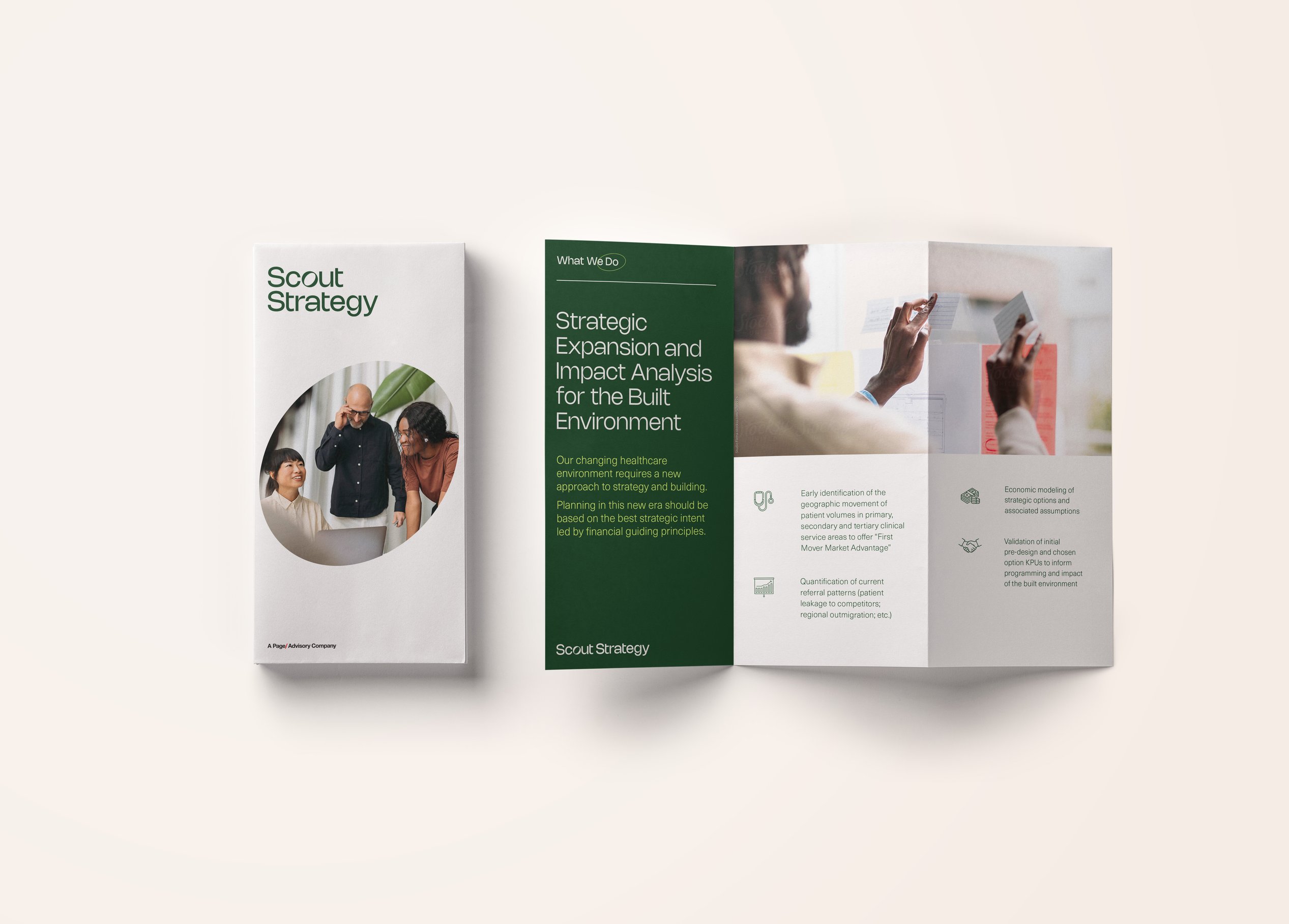
Scout Strategy delivers personalized advisory services to drive strategic expansion and impact the built environment in health sciences. Working at the intersection of strategic business objectives and architectural design, this new consultancy integrates the disciplines to meet the goals of both.
Page provided naming and identity design for the consultancy. The brand reflects the unique attributes of the group as well as its focus on the future potential of its clients.
Scout Strategy’s name aligns with its promise – staying ahead of the curve by integrating strategic planning, technology, and data analysis.

Identity
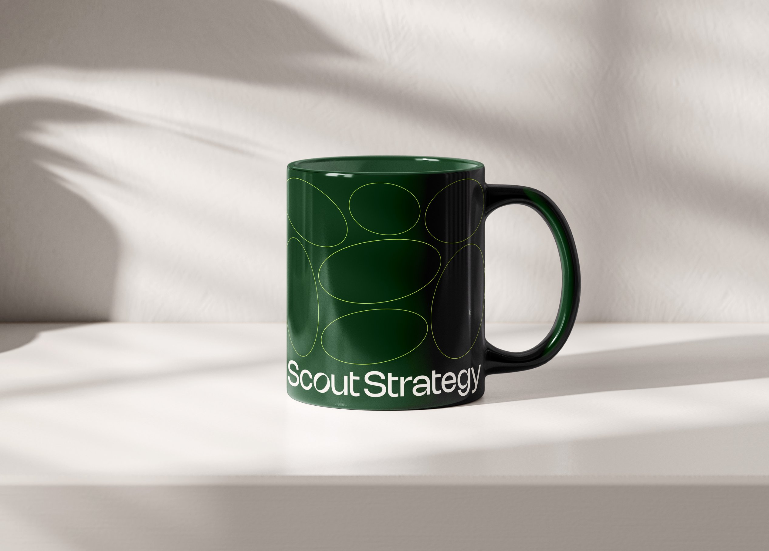
The Scout Strategy identity reflects the consultancy’s forward-thinking approach. The subtle tilt of the "O" in the logo is a visual cue, reinforcing the brand’s commitment to fresh perspectives, sharp insights, and a focus on what’s ahead.

Color balance
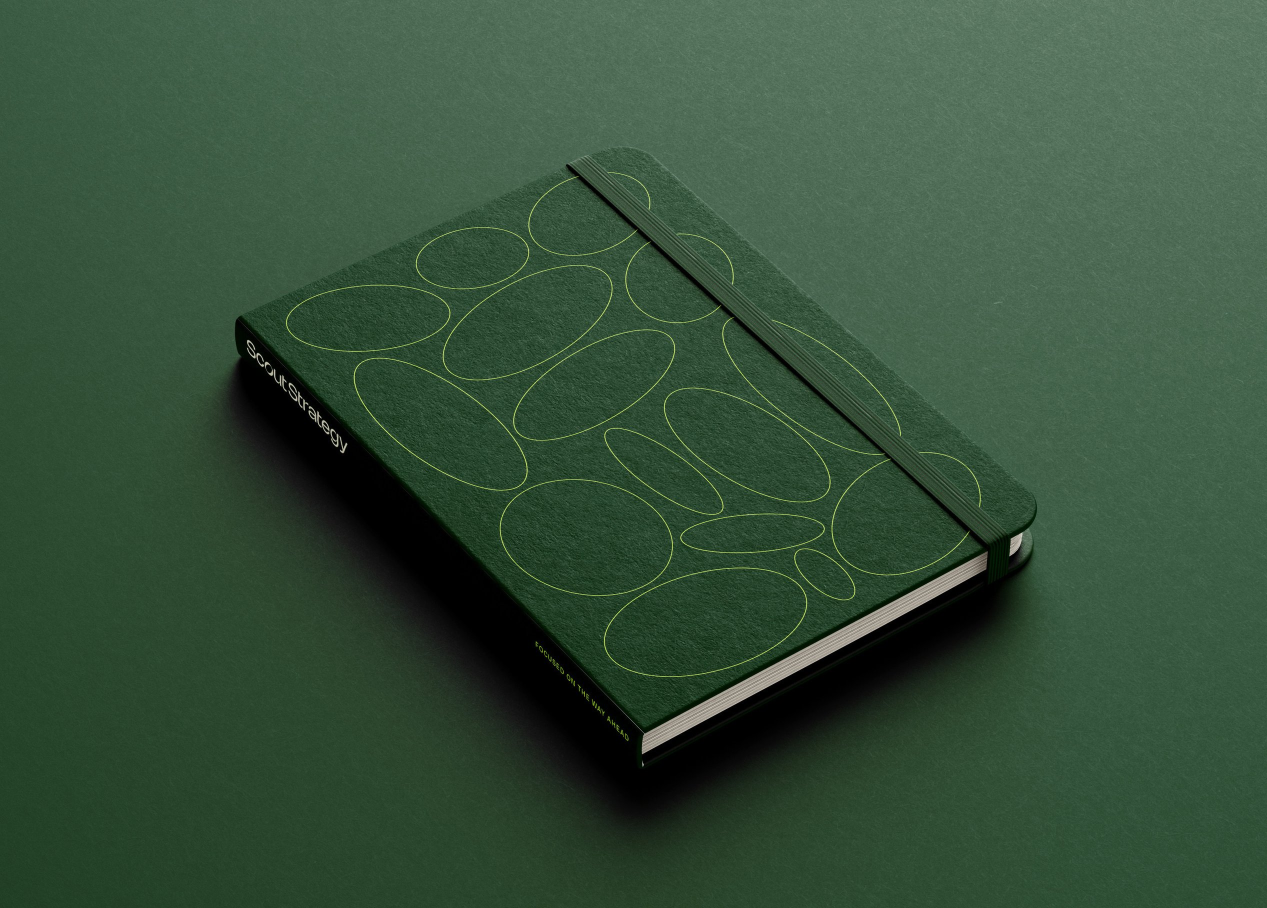
The color palette balances sophistication with energy. Neutral shades and a deep green convey stability with an inviting, approachable quality. A bright pop of green injects vibrancy, signaling fresh thinking, innovation, and forward momentum. Together, the palette reflects the consultancy’s blend of experience and bold new ideas.

Shaping the story
The brand pattern creates a dynamic sense of movement and perspective. More than just a visual element, it provides a flexible framework for brand expression—reinforcing Scout Strategy’s forward-thinking approach and adaptability.

Brand application


/
Similar projects



/

Talk with us
Complex challenges need fresh perspectives and deep expertise. Connect with our team to explore how we can help you create spaces that make a real difference.