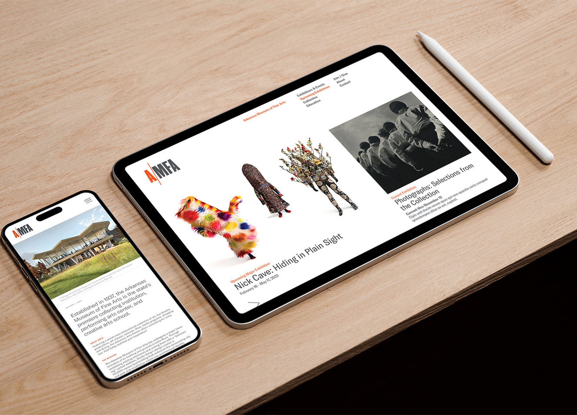
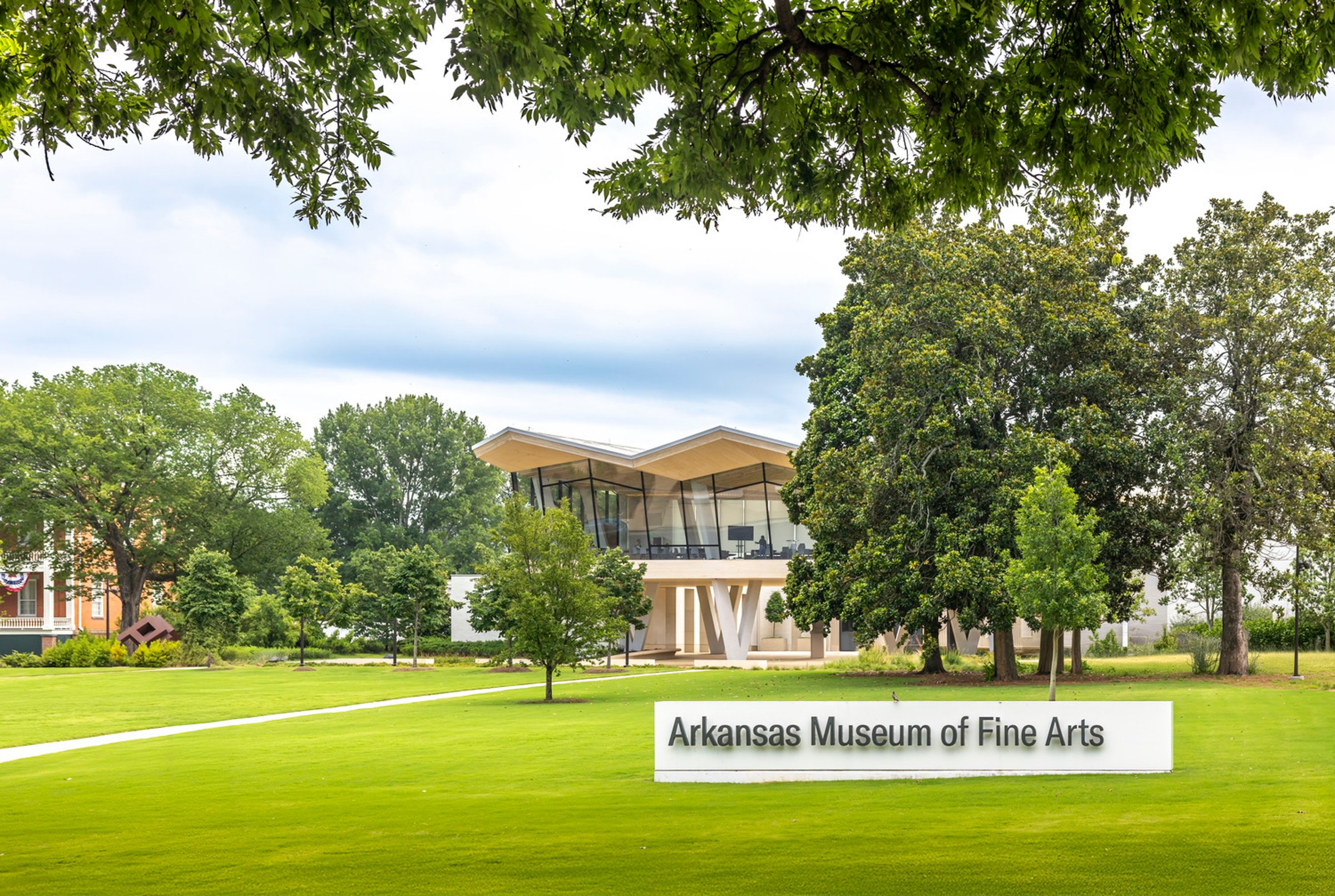
Arkansas Museum of Fine Arts
The Arkansas Museum of Fine Arts' transformation began with a bold vision—one that redefined both its physical space and its identity. Page’s branding team partnered with the museum to bring this vision to life, beginning with a discovery process that engaged key stakeholders and community leaders in Little Rock. Their aspirations informed not only the institution’s evolution from the Arkansas Arts Center to AMFA but also the creation of a cohesive brand identity.
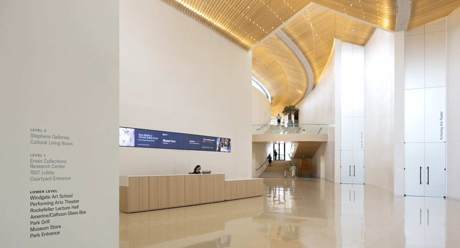
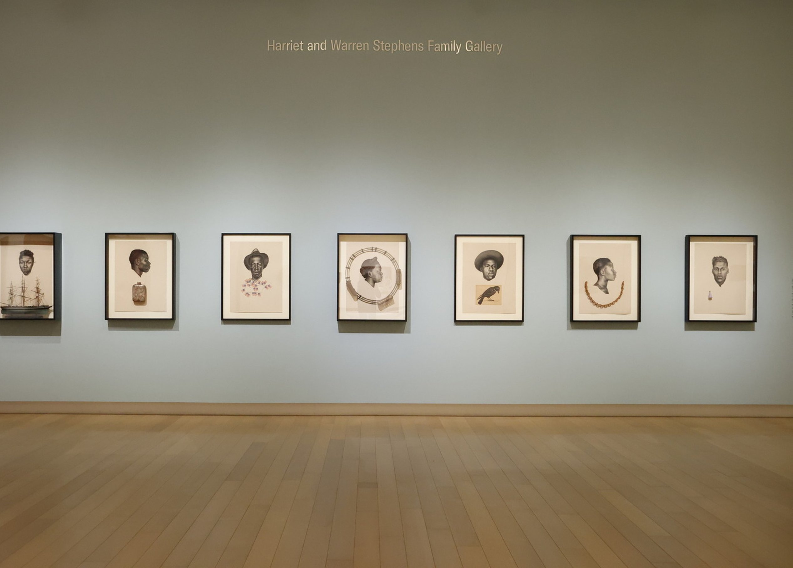
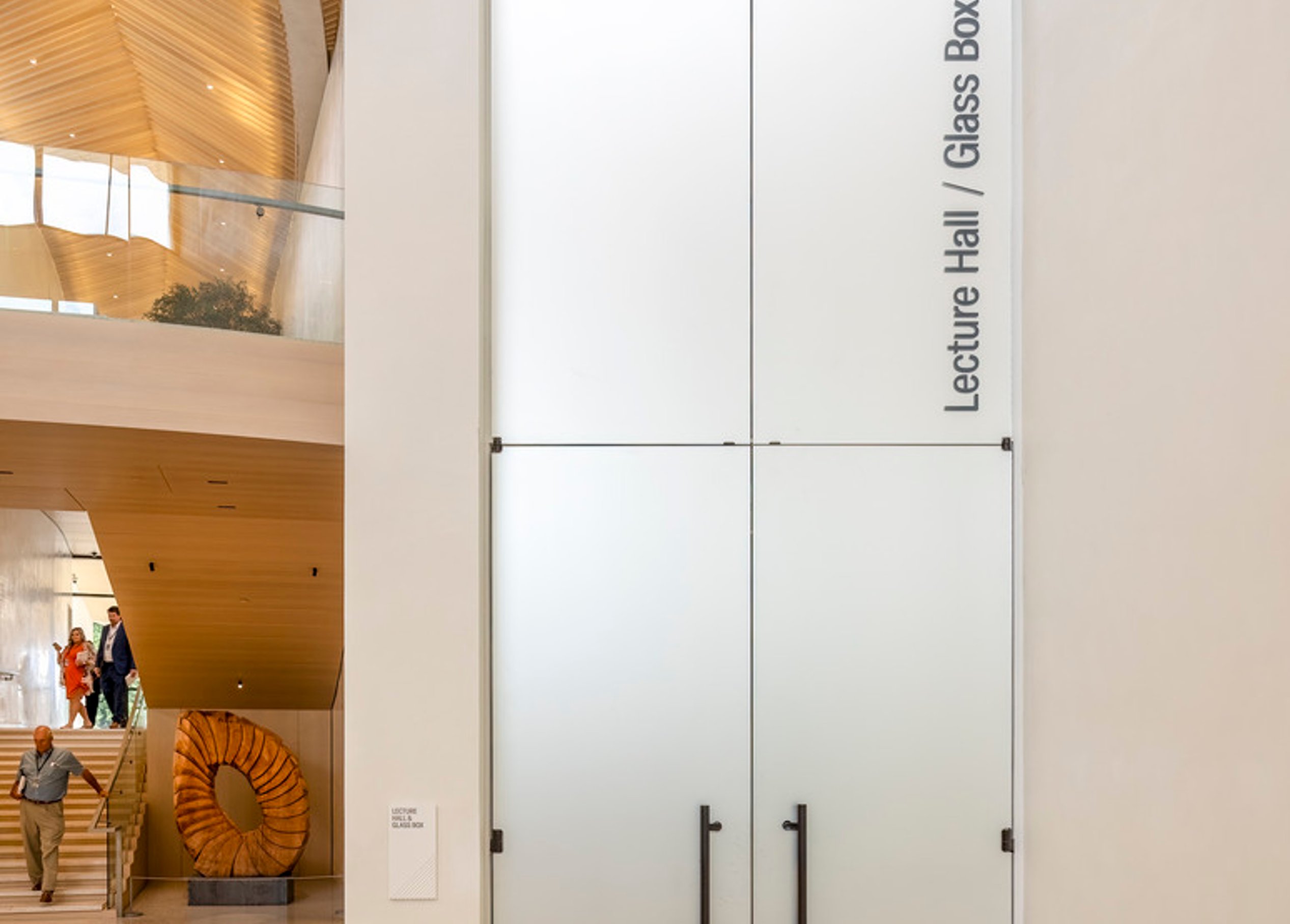
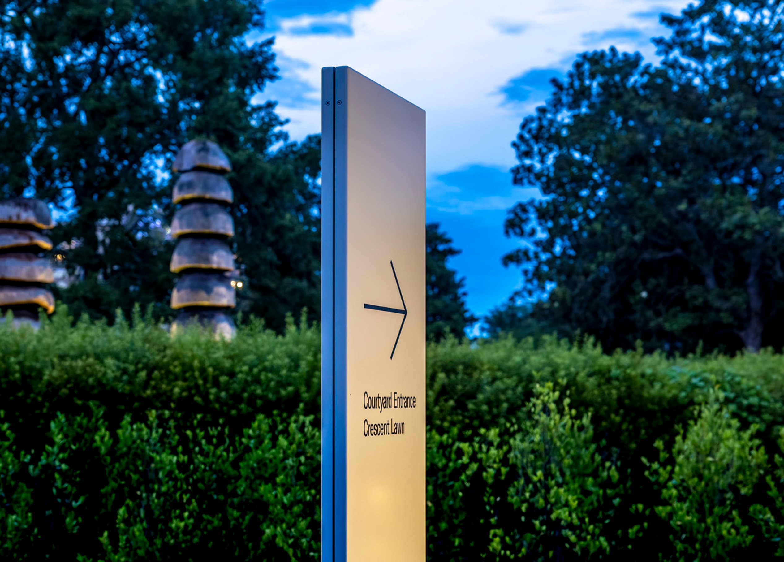
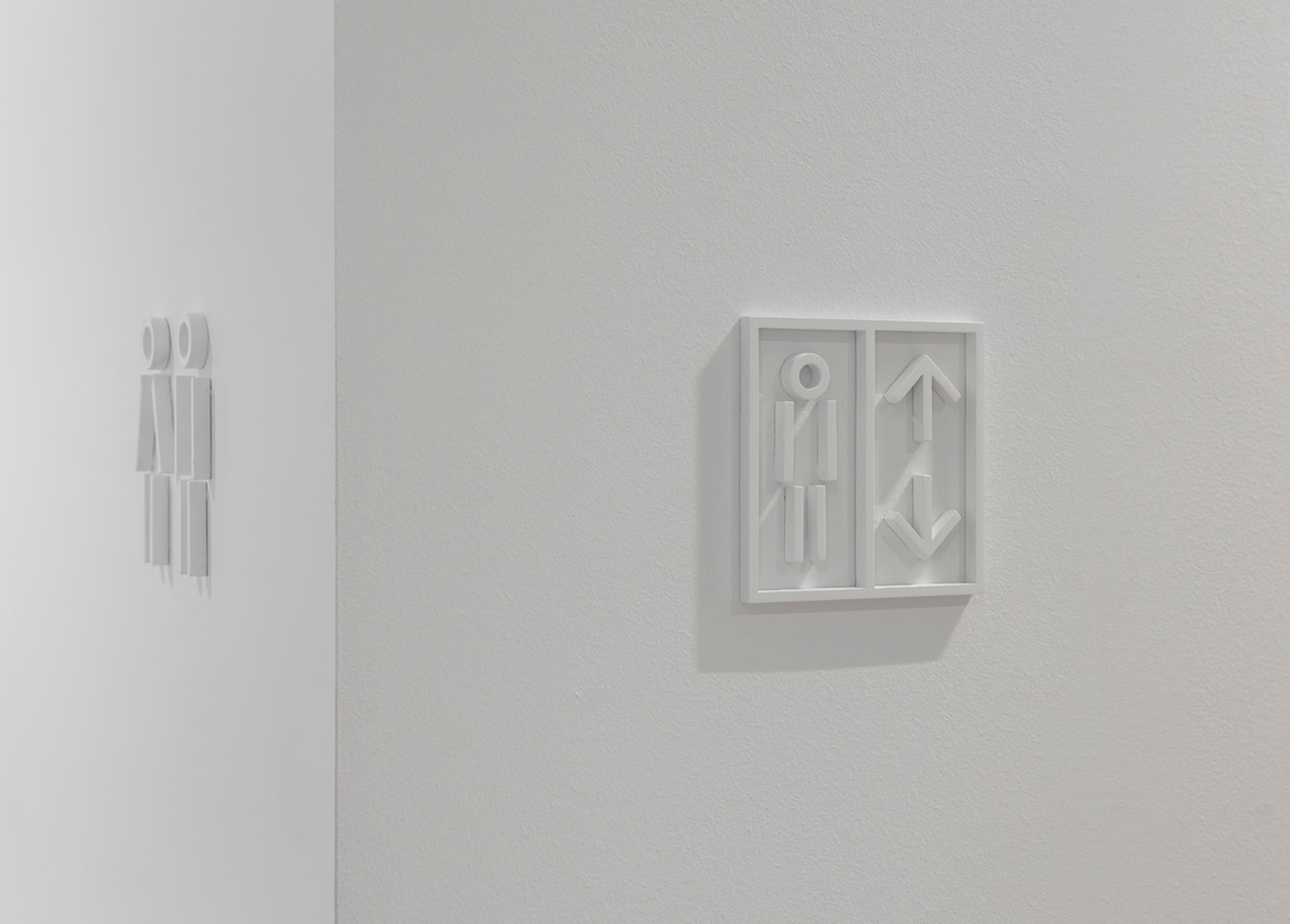
As the building took shape, Page designed a wayfinding system that seamlessly integrated with the architecture, ensuring visitors could navigate and experience the space with ease. A donor recognition system aligned with the architectural palette honors the generosity that made this transformation possible.
Today, AMFA reflects the goals set from the start—where thoughtful design, branding, and community engagement came together to create a lasting cultural destination.
Museum branding

Simple and versatile
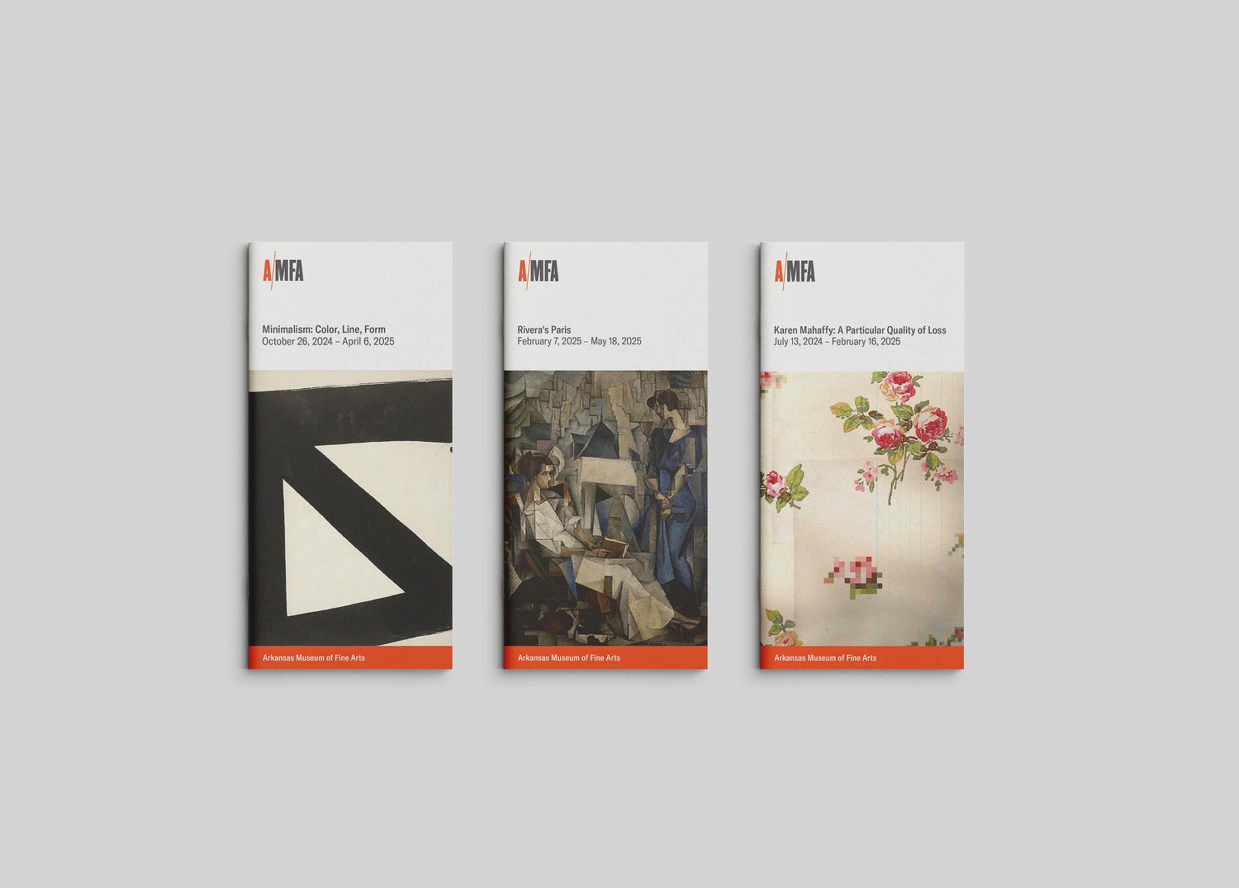
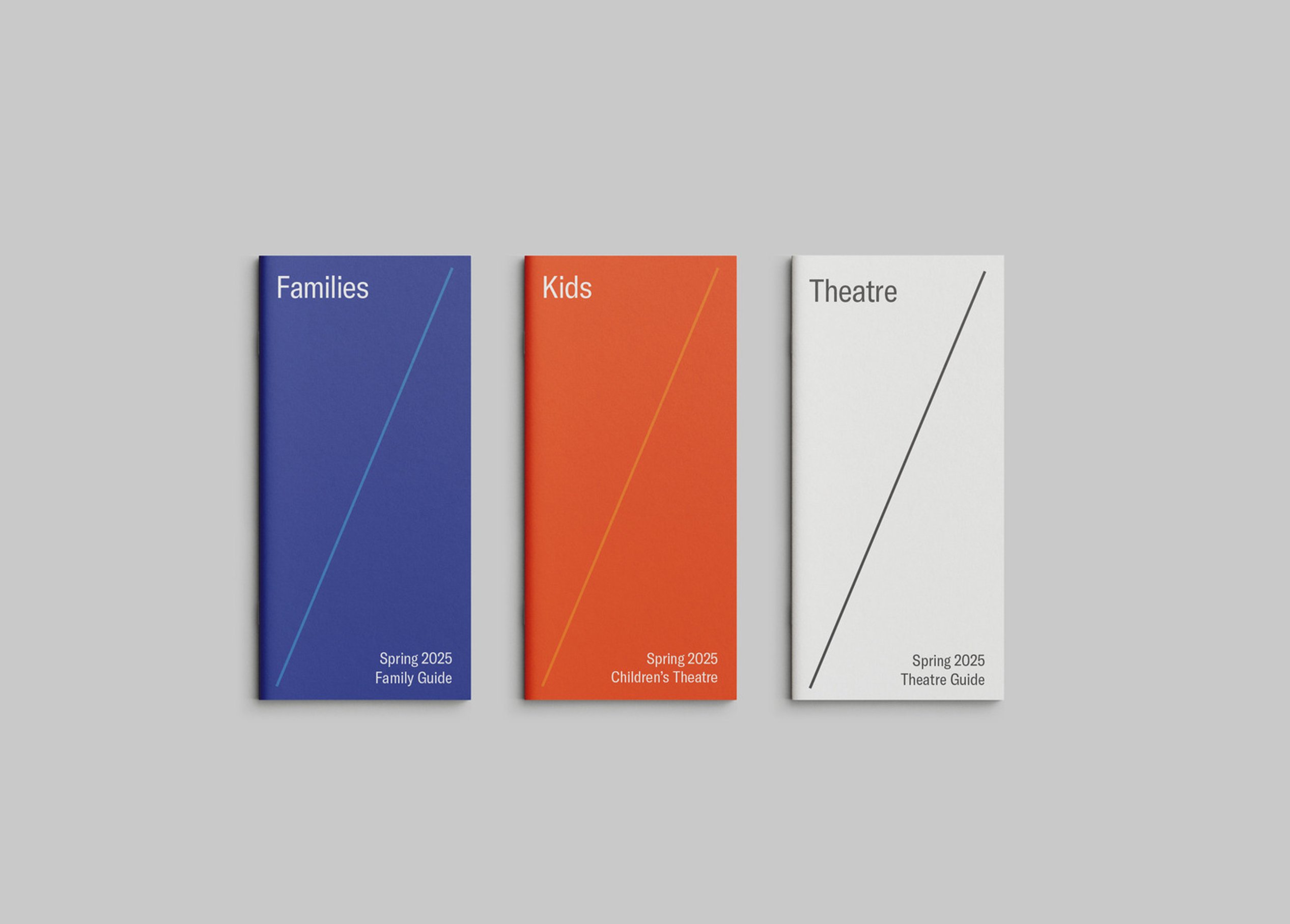
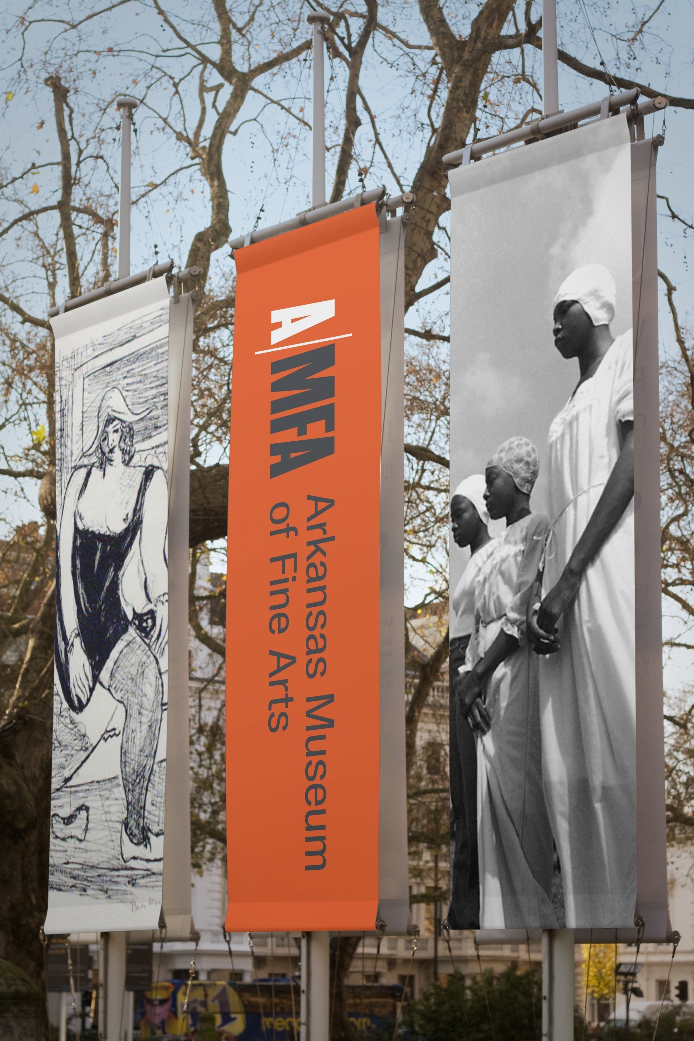
The brand kit was designed to be simple and intuitive to use. Logo marks, color, and diagonal devices are easily applied and combined to communicate and reinforce the brand.
When the project began, the organization known as the Arkansas Arts Center was housed in a facility that was maze-like and difficult for visitors to navigate, owing to multiple renovations over its life. Home to a children's theatre, an art school, and a permanent collection of drawings and contemporary craft objects – each of them renowned – a visitor to one of the programs might not even be aware of the other experiences available. Neither the name, nor the branding, nor the physical space were reflective of the high quality of offerings available to the public.
A major capital campaign and reimagining of the space was underway. The time was right to articulate a brand promise, re-name the institution, and design a compelling visual identity. Positioned alongside nationally recognized museums, the institution needed an identity that reflected its stature while embracing its diverse programming and new amenities.
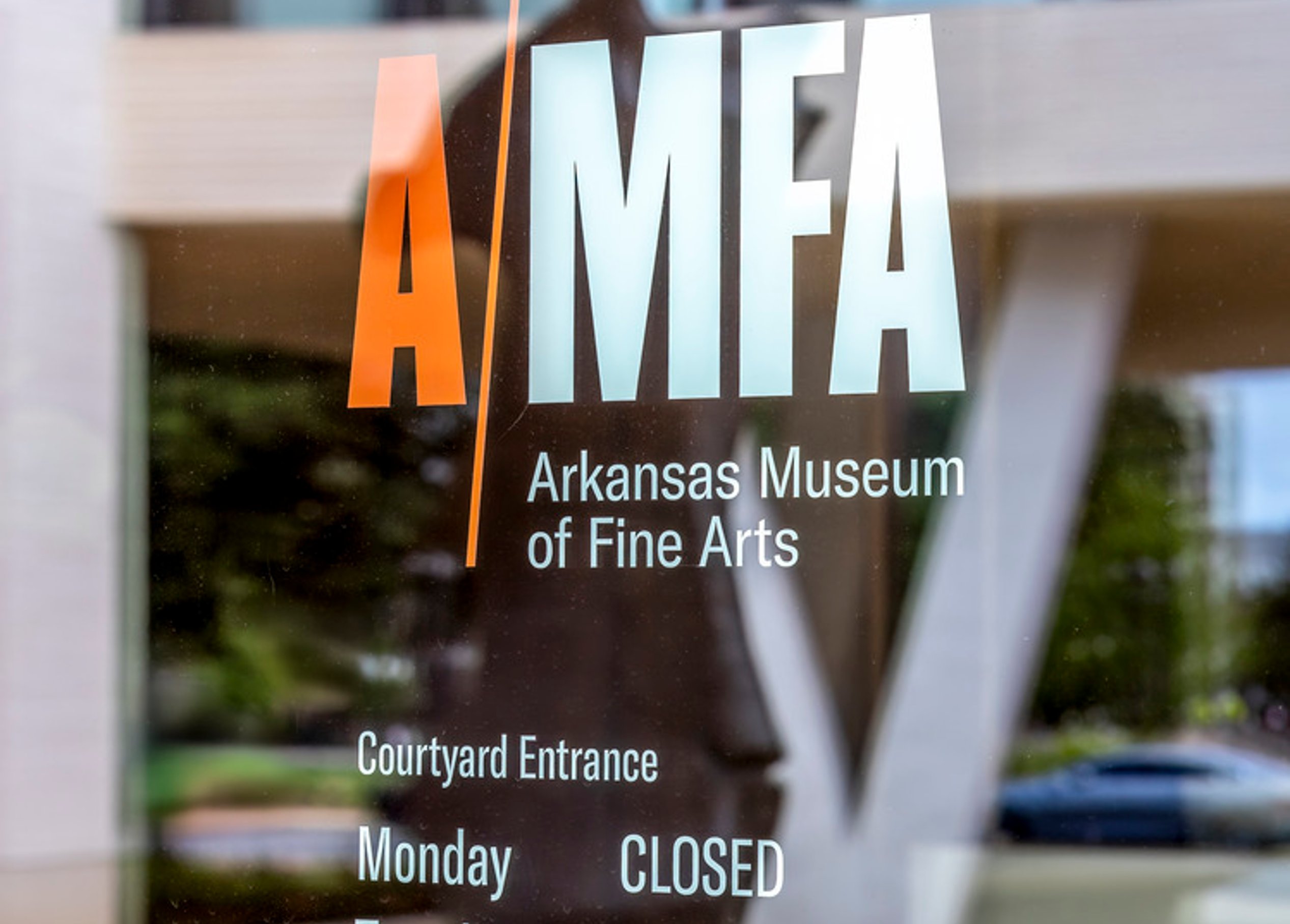
The visual identity drew inspiration from the angled lines of the architecture, while also incorporating a strategic break between "A" and "MFA" for clarity. A distinct color choice gave the museum a recognizable presence, ensuring a mark as dynamic and versatile as the institution itself. The refreshed brand identity was carried through the building with wayfinding, specialty graphics, and donor recognition and has informed the museum’s visual communication touchpoints.

Selecting brand colors
Choosing brand colors is a thoughtful process, guided by questions of identity, impact, and meaning. For the Arkansas Museum of Fine Arts, inspiration came directly from the art itself. Through exploration, a direction—orange—emerged, setting the foundation for the museum’s visual identity. From there, the search began. We gathered a selection of our favorite artworks to share, each reflecting the vibrancy and spirit of AMFA’s new brand.
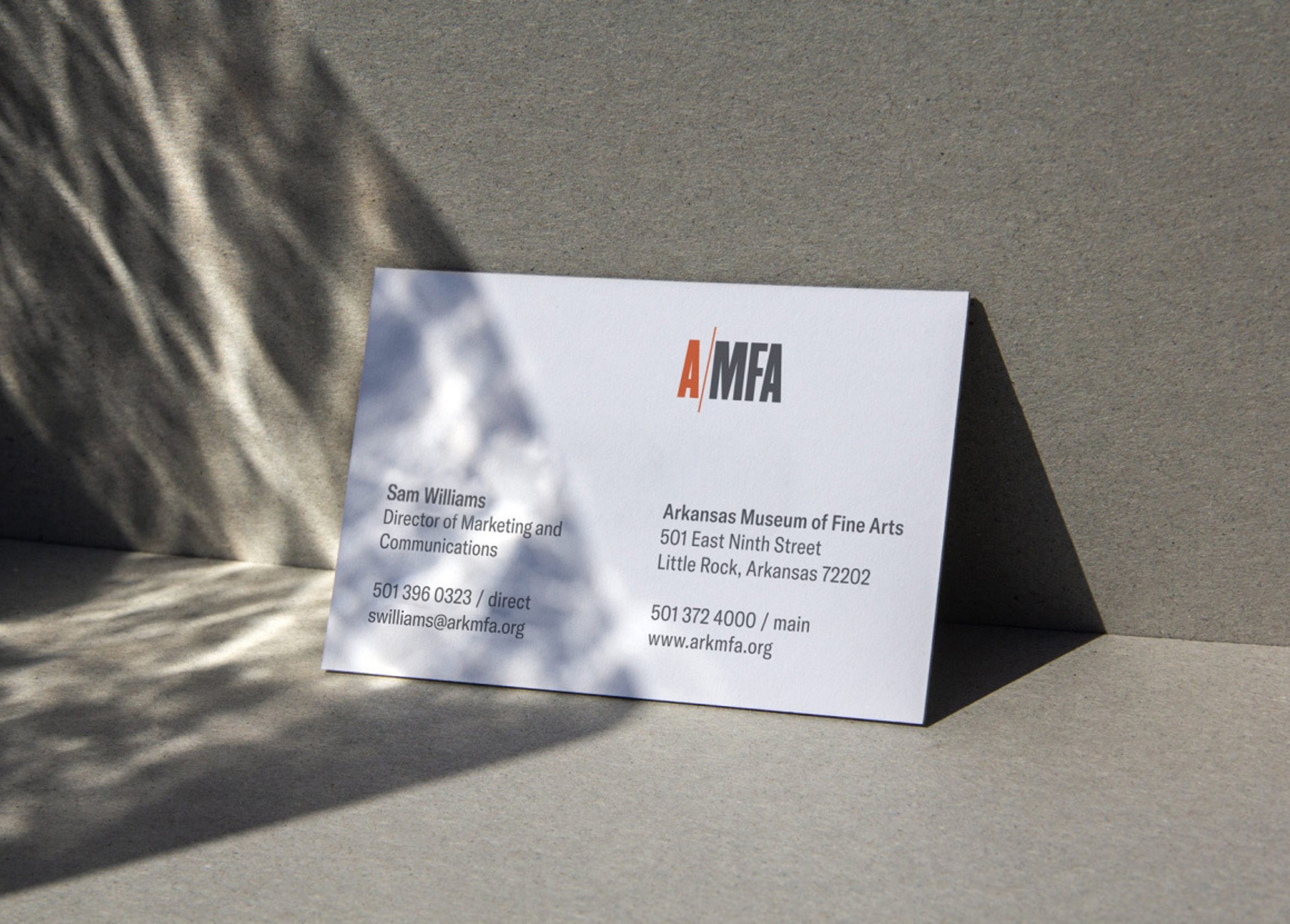
Museum identity applications

/
Museum signage
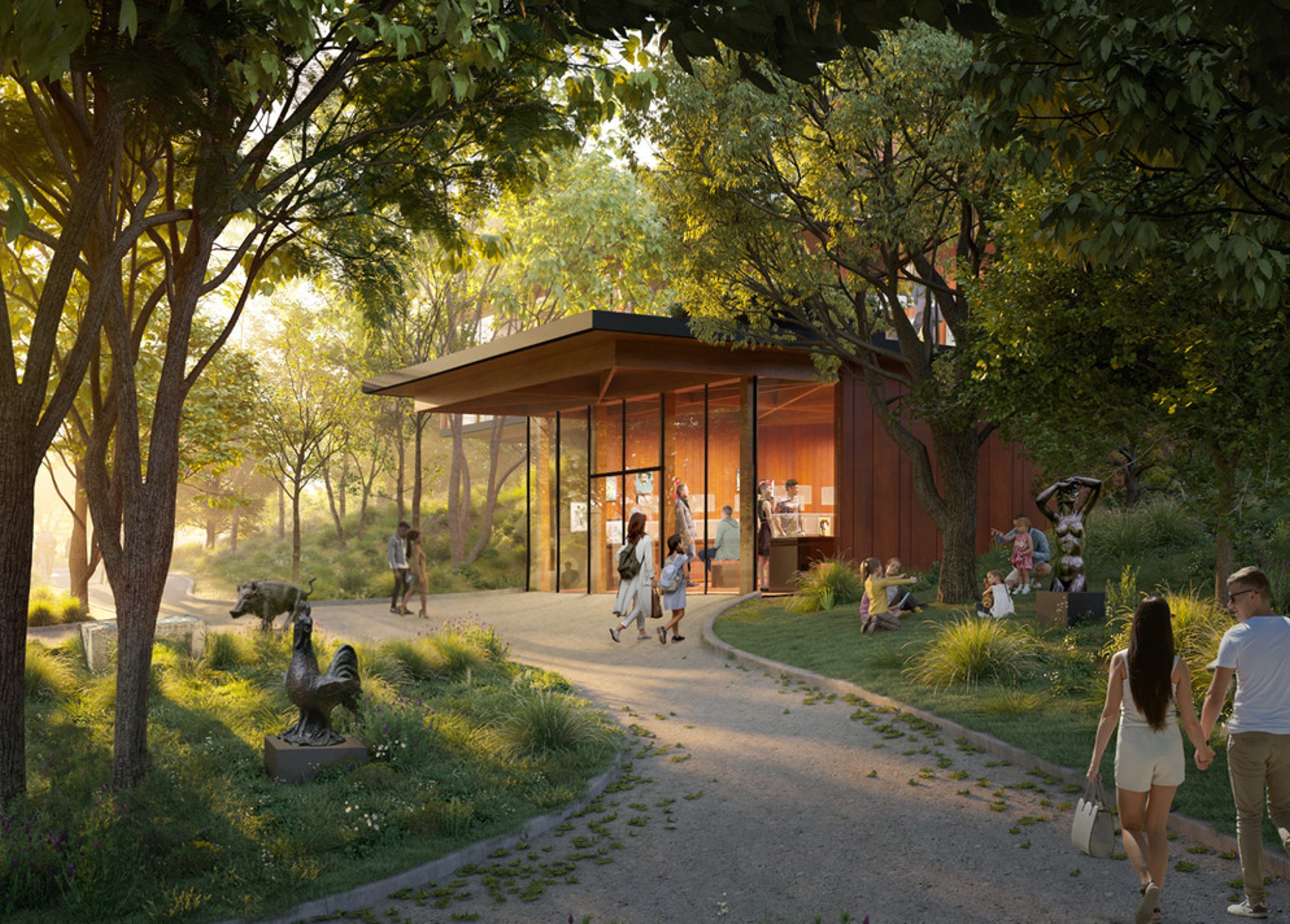
The museum’s transformation, designed by Studio Gang, includes new construction and renovations. The design enhances clarity, connection, and community. Thoughtful signage and donor recognition elements complement the stunning new spaces and ensure effortless wayfinding and a welcoming experience.
Museum experience
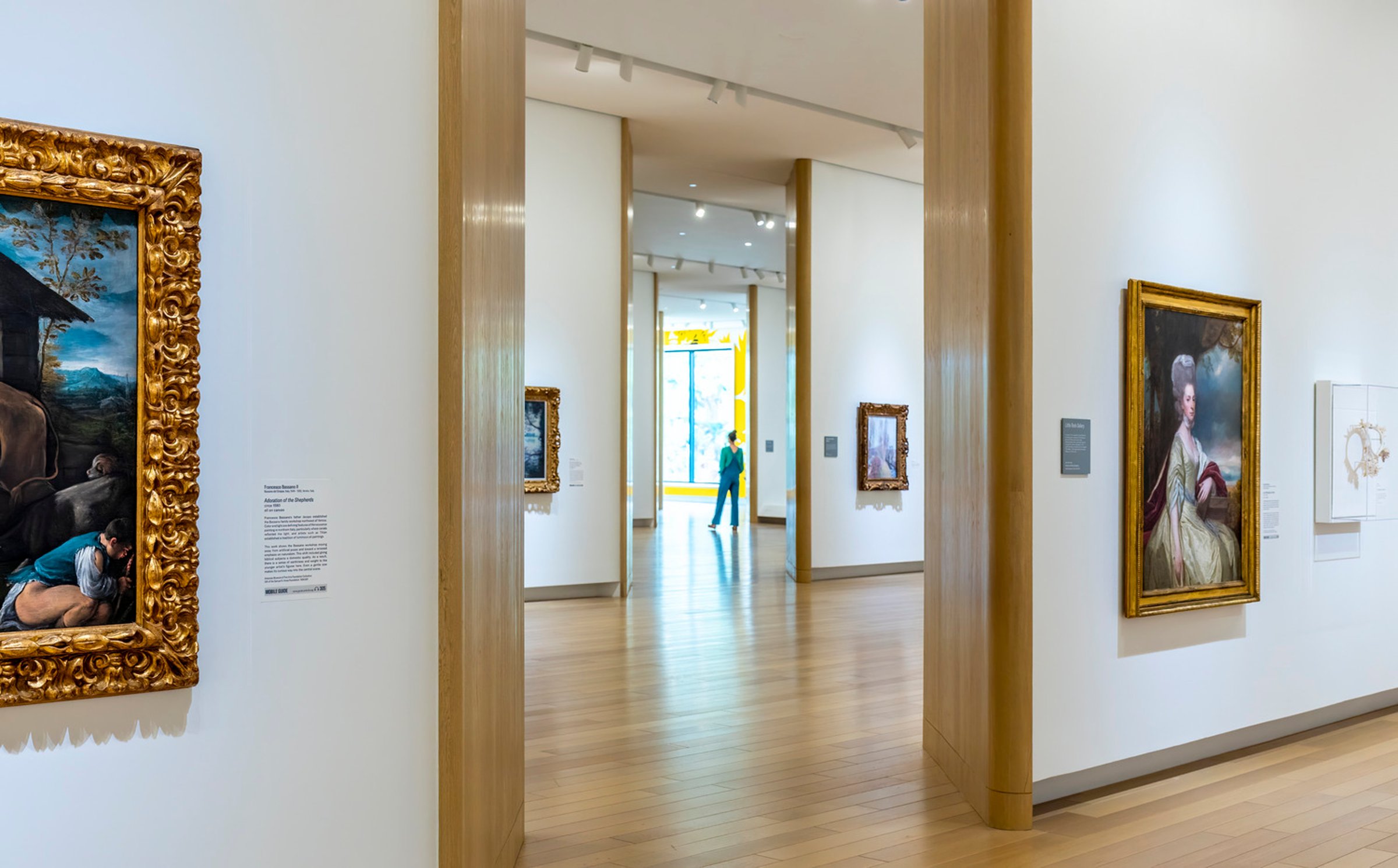
Open invitation to explore
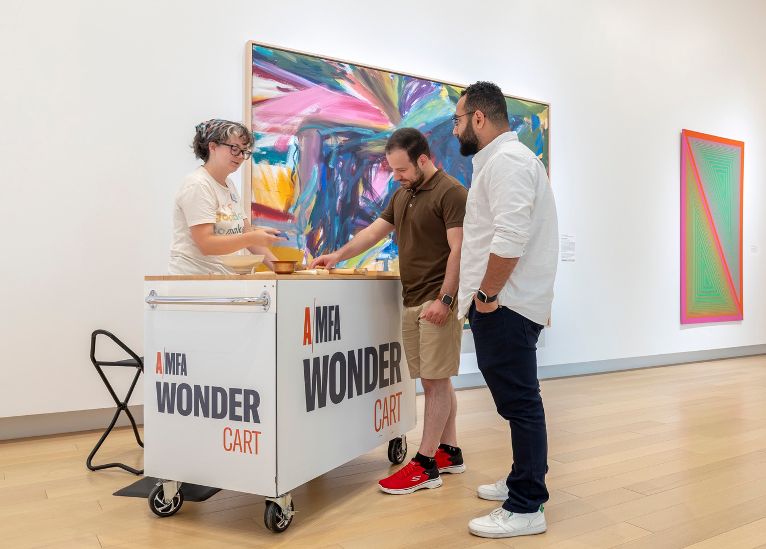
With daily free admission, AMFA welcomes the Little Rock community to explore, connect, and experience the power of art.
Donor recognition
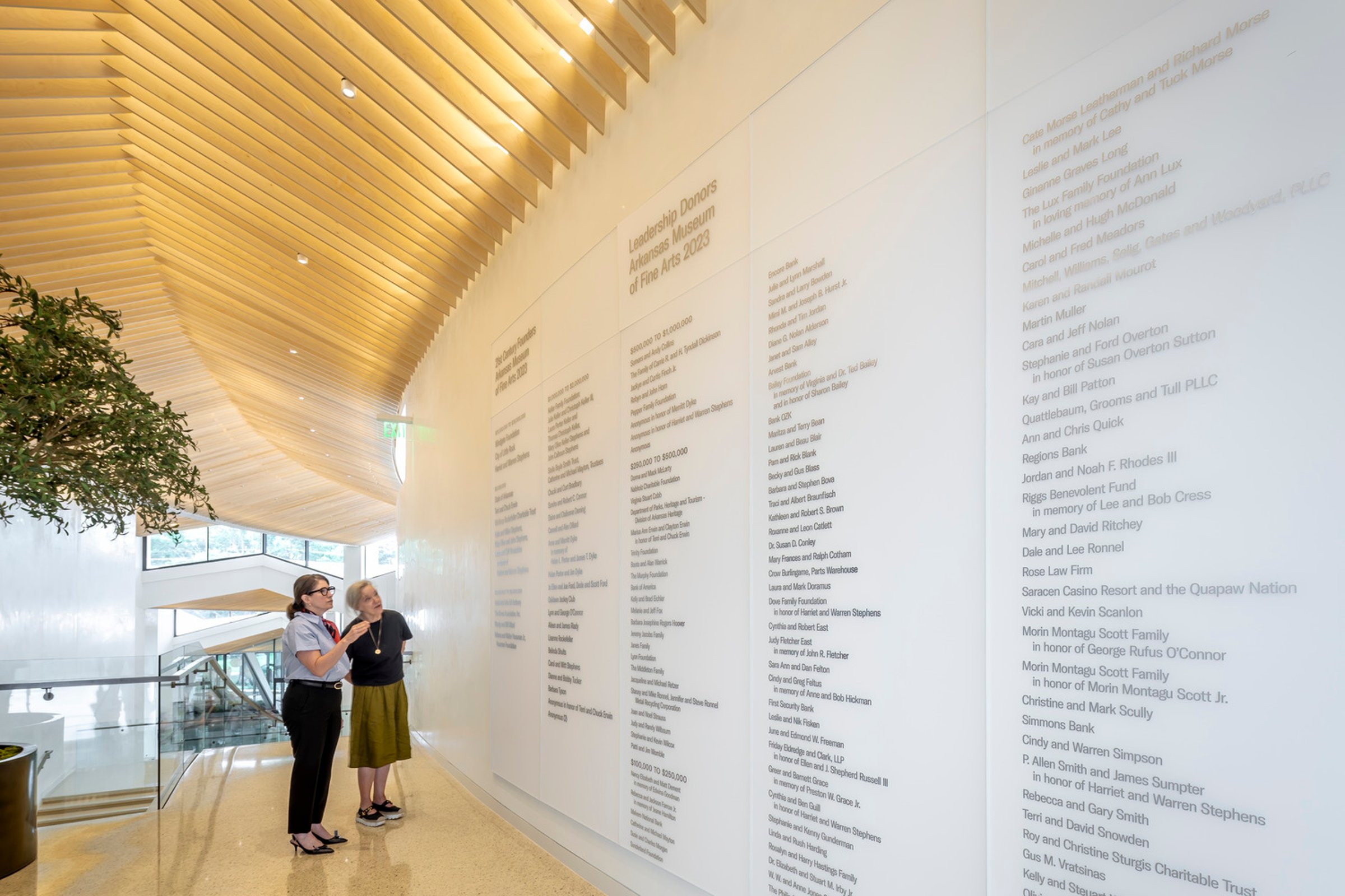
Donor and wayfinding
/
Similar projects

/

Talk with us
Complex challenges need fresh perspectives and deep expertise. Connect with our team to explore how we can help you create spaces that make a real difference.